Enhancing the Buda Public Library Catalog with User-Focused Features
Phase 1
This case study is a work in progress— last updated on January 12, 2025.
This project began with a curiosity for improving the library experience for patrons at the Buda Public Library in Buda, Texas.
Project Scope
Role
UX Designer + UI Designer
Timeline
Phase 1 - 14 weeks
Skills
User Research, Information Architecture, Wireframing, Visual Design, User Testing, Prototyping
Tools Used
Chat GPT, FigJam, Figma, Lyssna, Maze, Supernormal
What I Did
Competitive Analysis, User Research, Information Architecture, Web Design, Feature Improvement, Usability Testing, User/Task Flows, Wireframing, Interaction Design & Prototyping
Project Origin Story
As a frequent user of the Buda Public Library, I often felt frustrated with its online catalog system. Managing book lists was tedious, and the platform lacked tools to help users track their literary journeys or share their interests. This sparked a question: What if the catalog could do more to enhance patrons’ experiences?
Conversations with three library staff members revealed a common frustration—BPL’s catalog lagged behind those of larger urban libraries, leaving both librarians and patrons with unmet needs. Their feedback inspired me to take on this challenge.
While I initially focused on improving book list management, my training as a designer urged me to set aside assumptions and approach the problem with an open mind. User surveys and interviews highlighted a bigger issue: 4 out of 5 patrons were dissatisfied with the catalog, confirming the need for meaningful change. Researching other library systems further emphasized that innovation isn’t always about starting from scratch—it’s about adapting proven ideas to meet unique needs.
This hypothetical project, though rooted in reality, underscored an important insight: government-funded platforms like library systems often lack resources to prioritize user experience. Through this project, I explored how thoughtful UX design can transform digital platforms into more inclusive, functional, and user-friendly tools.
The Problem
The Buda Public Library's online catalog system, though functional, doesn't fully meet patron needs. Users find it difficult to manage book lists, track reading interests, and discover new resources. While urban libraries offer more sophisticated catalog systems with user-friendly features and personalization options, Buda's current system leaves patrons frustrated and disengaged. Despite limited UX design budgets typical of government-funded platforms, there's a clear opportunity to enhance the library catalog through user-focused improvements. Additionally, the website lacks several basic accessibility features that need attention.
The Insight
User research uncovered that the catalog failed to meet essential patron needs. Many users abandoned the catalog entirely, relying on staff assistance instead. Patrons struggled with three main challenges: finding relevant information, using the mobile interface, and determining age-appropriate content. These issues highlighted how poorly the catalog served its diverse user base. Though I initially set out to improve book list management, research revealed a better path forward. Redesigning the search results page would solve more urgent user frustrations, enhance staff efficiency, and boost engagement—while requiring minimal system changes.
The Hypothesis
By redesigning the search results and item details pages with clear content hierarchies and prioritized information, we'll create a more seamless experience for library patrons. This improved book discoverability will help users regain trust in the catalog's accuracy and usability.
These enhancements will increase patron satisfaction, digital tool usage, and overall engagement with library resources. Librarians will also benefit from streamlined access to lending information and improved tools for patron assistance.
The Solution
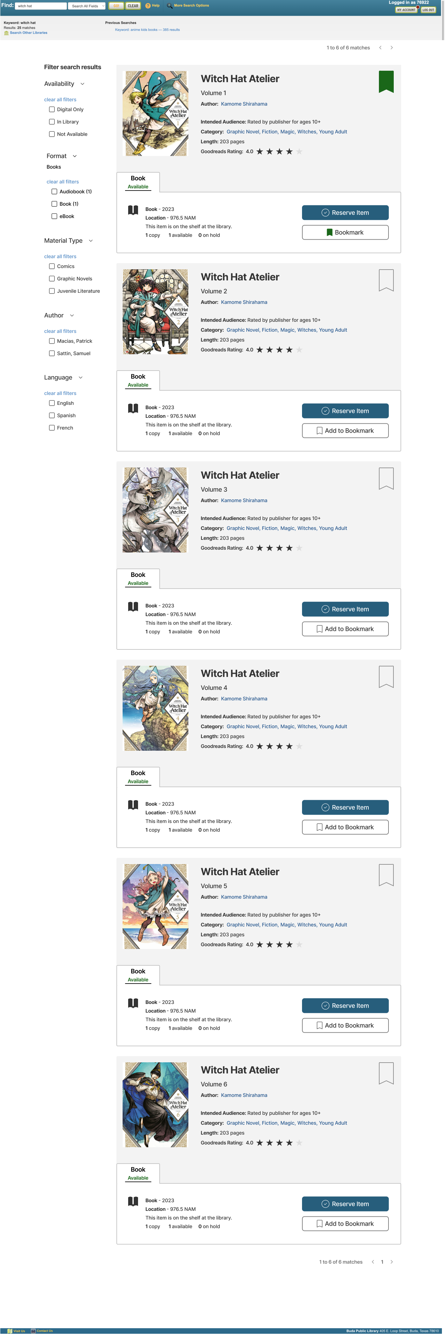
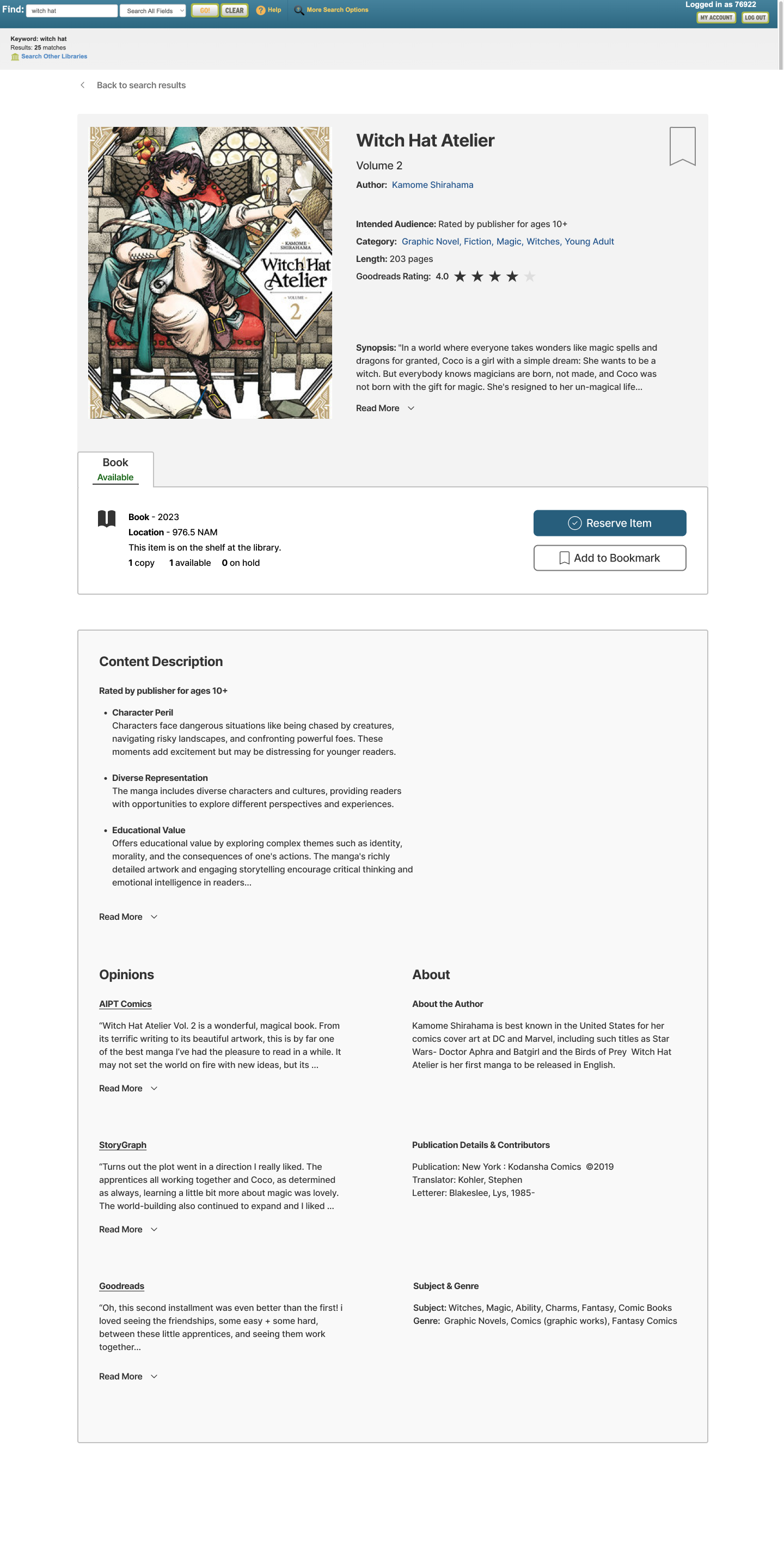
To address user frustrations, I applied design principles such as grouping related information and using intuitive content hierarchies. Chunking techniques were employed to present details in digestible sections, making it easier for users to find relevant information without feeling overwhelmed. The search results and item detail pages were redesigned with a clear content hierarchy, allowing users to access key details—such as intended audience, cover images, book length, and reader reviews—quickly and efficiently. These changes were grounded in research and best practices from other library systems and bookstores, ensuring a practical, user-tested solution.
The redesign enhances the user experience by improving self-service and reducing library staff intervention. With more accessible information, staff can assist patrons more effectively, while users benefit from a more intuitive and engaging catalog.
The Validation
Design decisions were driven by user insights, ensuring the redesign addressed key frustrations. In user testing, 88% of participants found it easy to reserve, cancel, add, and remove books from their bookmarks. All testers successfully located specific book information, achieving a 100% success rate. Testers praised the intuitive layout and clear reservation confirmations. The only feedback about text size was due to a test setup error, not a design flaw. Overall, the user feedback confirmed that the redesign effectively improved the catalog’s usability and addressed core issues
The Impact
The redesign of the Buda Public Library catalog significantly improves the user experience by making the system more intuitive and relevant to patrons' needs. These enhancements address common frustrations, such as difficulty finding appropriate content, making the catalog a more reliable tool for discovering resources. For library staff, the redesign streamlines workflows, empowering them to serve patrons more efficiently with better access to information.
Beyond the City of Buda, these changes can be easily adopted by other libraries in Hays County, expanding the impact of the redesign across the region. This project demonstrates how public systems can be user-centered and efficient, encouraging greater engagement and trust in library services.
Goals / KPIs
Improve Catalog Usability
These metrics aim to ensure that library patrons can successfully navigate and use the catalog, reducing their reliance on staff assistance and making the experience seamless and enjoyable.
90% of users should successfully recognize the bookmark feature and add or remove a library item to/from their bookmarks.
85% of users should be able to confidently reserve an item and cancel that reservation without assistance.
80% of users should find item details easily on both the main item page and the search results page.
Increase Adoption of Book Functionality
These metrics focus on encouraging users to engage with the bookmark feature, making it a valuable tool for managing their library experience.
70% of users should report ease of use for the bookmark functionality.
Non-hypothetical business goals might include tracking increased bookmark usage and the creation of saved book lists by patrons.
Ensure Accessibility Compliance
These metrics address foundational accessibility issues, ensuring the catalog meets industry standards and creates a better experience for all users.
Achieve WCAG 2.1 accessibility compliance at Level AA or AAA for hierarchy of content, grouping, and color contrast.
90% of users with accessibility needs should report that the catalog is visually clear and easy to navigate.
Support User Decision-Making
These metrics aim to provide patrons with the information they need to make confident decisions about reserving items.
85% of users should find integration of the ratings system helpful in understanding the content of the items they’re interested in.
75% of users should feel the catalog provides the information they “need and want to know” about items.
Continual Feedback and Learning
These metrics emphasize learning from users and stakeholders to continually improve the catalog’s design.
85% of users should find integration of the ratings system helpful in understanding the content of the items they’re interested in.
75% of users should feel the catalog provides the information they “need and want to know” about items.
80% of surveyed library staff should report that the updated catalog supports their ability to assist patrons more effectively.
Collect qualitative feedback from library staff to identify areas of improvement and understand the indirect benefits of the catalog enhancements for staff workflows.
The Design Process
Step 1 - Research & Discovery
Discovery: Library staff conversations, local patron interviews, and secondary research, including a broad competitive analysis.
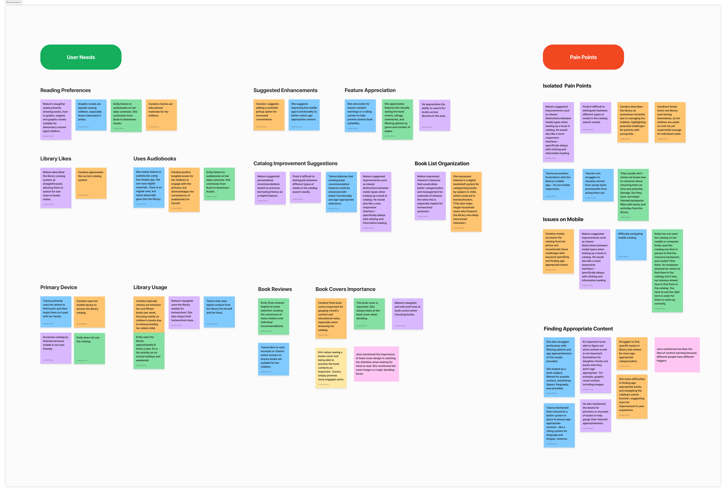
Synthesizing Insights: Affinity mapping to uncover problems and potential solutions from the data.
Step 2 - Define the Problem & Strategy
Problem Framing & Ideation: "How Might We" questions to guide creative thinking.
Competitive Analysis for Focused Research: A deep dive into 3 public library catalog systems.
Step 3 - Structure the Experience
Information Architecture: Structuring the content for sitemap, menu navigation, & content hierarchy
Core Flow Design: Design & refine the primary breath exercise components, and discover prototype capabilities
Design User Flows & Task Flows
Step 4 - Design, Test, & Iteratie
Low → Mid Fidelity Wireframes
User Testing, Feedback Synthesis & Iterations - Round 1
Low → Mid Fidelity Wireframes
User Testing, Feedback Synthesis & Iterations - Round 2
Step 5 - User Interface
Redefine brand colors based on the current brand.
Step 6 - Final Iterations & Prototype
Final High Fidelity Wireframes & Last Iterations: Refine, organize, and prepare final wireframes.
STEP 1 - RESEARCH & DISCOVERY
Research and discovery guided the designs to improve the Buda Public Library (BPL) online catalog used by patrons. We started with the idea improving a booklist feature, but research showed users value the feature, it wasn’t a top priority. We evaluated BPL’s neighboring competitors, a media/book shop, and an urban, out of state public library system. The information revealed in the research & discovery fed into all of the design decisions made in this project.
Competitive Analysis
The Buda Public Library (BPL) in Buda, Texas provides free library services to Hays County residents. The library's mission is to support lifelong learning and early literacy in a welcoming space. Buda is located just outside of south Austin and is considered a suburb to the city.
Austin Public Library (APL) in Austin, TX - a neighboring library system in Austin, Texas that includes the Central Library, the Austin History Center, and 20 branches.
Half Price Books (HPB) operates more than 120 stores in 19 states with several locations round Austin. The company's motto is "We buy and sell anything printed or recorded except yesterday's newspaper", and many of the used books, music, and movies for sale in each location are purchased from local residents.
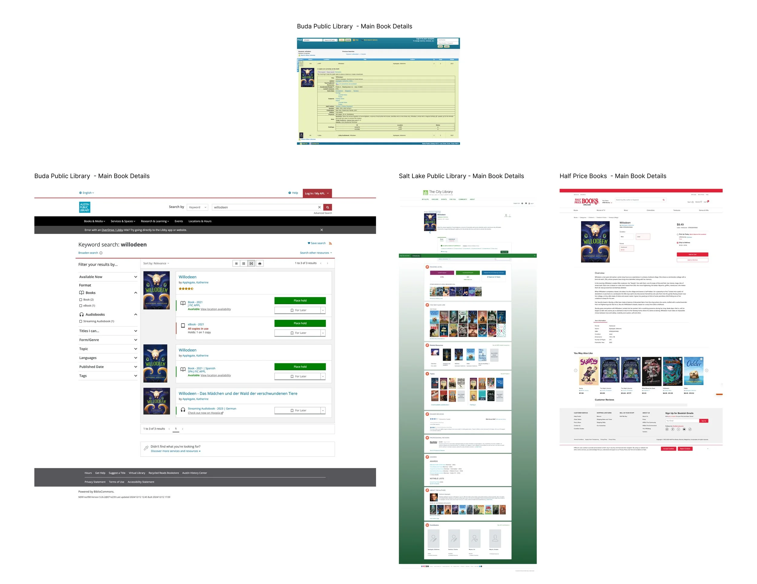
I extended the competitor analysis to include the Salt Lake City Public Library (SLCPL) in Utah. I evaluated how the Salt Lake library displayed search results. Later on I used organized their content and compared it directly to Buda, Austin, and Half Price Books.
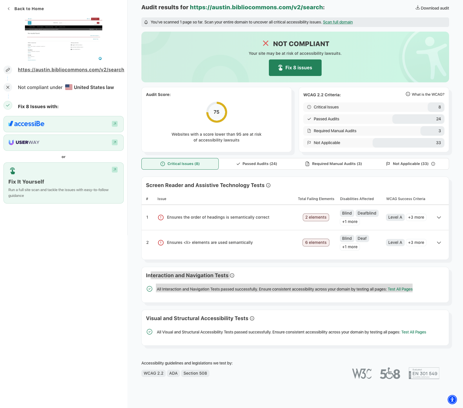
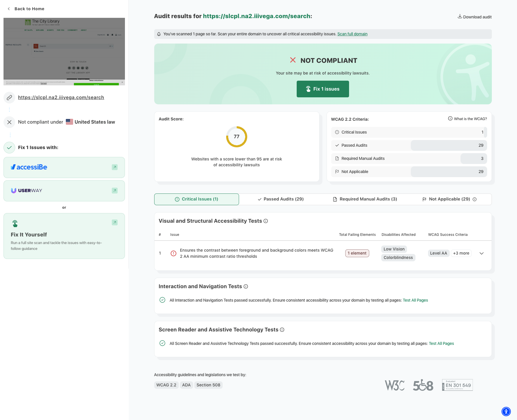
I also ran BPL and the competitors through an accessibility checker for an accessibility audit.
Project Impact
Understanding of what already exists in the public library sector is important. This realization lead me to, later on in the project, evaluate all 3 competitors for flows and to check out their design patterns, hierarchy & content.
This stage of the analysis helped me better identify the information competitors think are important to the catalog/search results and how they’re displaying it. It also allowed me to see the extent of the features offered to users through each.
I identified trends and gaps in current offerings to help identify opportunities. I blended the best parts of each system and incorporated what the BPL user wanted (larger cover images, content description, age recommendations, etc).
Accessibility audits of the Buda Public Library (BPL) catalog and competitors using had a meaningful impact on the project. They helped identify key issues like poor color contrast, small text, and navigation challenges, providing a baseline for improvements. Comparing BPL to competitors revealed valuable insights and best practices, ensuring the redesign prioritized accessibility and created a more inclusive catalog for all users.
Buda Public Library (BPL) Accessibility Audit
APL Accessibility Audit
SLCPL Accessibility Audit
Competitor Analysis - Search Results Comparison
Competitive Analysis - Main Book Details Comparison
User Interviews
6 participants in total
all telephone interviews
4 females and 1 males
4 Adults aged 30-40 years old and 1 mid 20 year old
Interview Participants
Zoomed In - Interview Affinity Map Synthesis
Zoomed Out Affinity Map
Interview Affinity Map Takeaways
User participants thought enhancing the booklist feature was not a top priority feature.
66% of interview participants used the Buda Public Library and Kyle Public Library, which use the same catalog system.
All participants prioritized finding the “right” kind of content. Users want a good view of the cover, to preview additional content and see images, read reviews, book length or audio time, content warnings or ratings, language availability & age recommendations for content. All of this content fits well together on a search results page and the main detail page for the specific item.
Buda Public Library Asst. Director and Youth Librarian, Caitlin Foley mentioned a need to improve website accessibility for users.
Project Impact
The content fits well together on a search results page and the main detail page for the specific item. There’s room to maximize space on search result and main item detail screens. We can keep what the library needs include helpful details that library patrons value.
We can consider Goodreads, The Story Graph, Common Sense Media as a potential rating system to inform the audience about content, language, age recommendation, pages in book.
As the designs progress, I was mindful of accessibility standards. The goal was a WCAG recommendations of AA or AAA
There was a plethora of information learned in research and to guide the project. Austin Public Library and SLC Public Library, we’d now be able to identify design patters and different ways the information was displayed.
I had 3 short conversations with the library staff early on that reinforced the prioritizing accessibility to make the catalog more user friendly.
STEP 2: DEFINE PROBLEM & STRATEGY
The Buda Public Library catalog presented a key challenge: users didn’t find the system helpful for their needs. While it provides basic inventory information, the catalog lacks essential accessibility features and doesn’t offer the detailed content insights patrons want when deciding whether to check out an item.
How might we support patrons by get more out of the public library catalog?
Defining the Problem
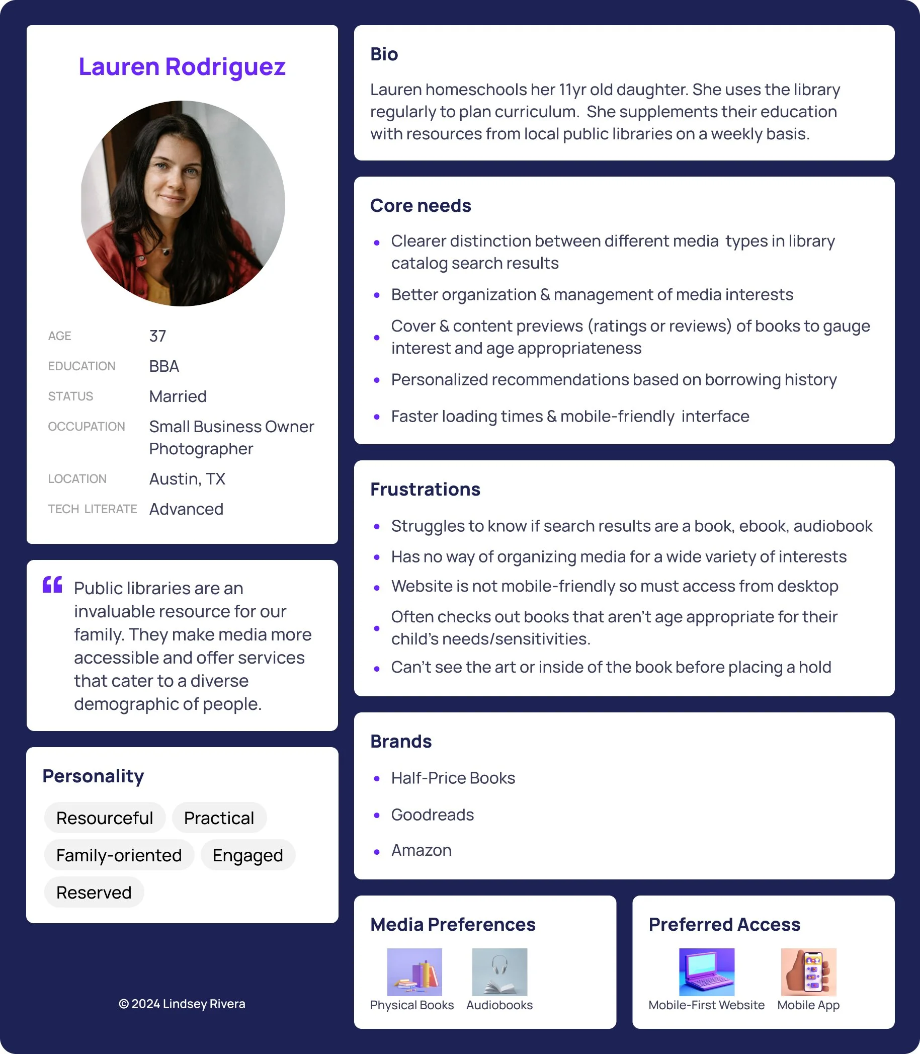
To narrow the project’s scope, we focused on a significant demographic of library users—mothers with school-aged children—who frequently rely on the library as a key resource. These users want to easily find age-appropriate content and quickly determine if a book or item meets their child’s needs.
The current system left them frustrated due to a lack of:
Detailed item descriptions (e.g., content ratings, age recommendations).
Intuitive features like hold and bookmark management.
Accessibility standards that make the catalog clear and user-friendly.
The Problem Statement: Mothers with school-aged children have a hard time finding age-appropriate content in the library catalog and struggle to determine if a book’s content aligns with their child’s needs.
Develop a Strategy
To address the problem statement I used several tools and frameworks to guide the project.
User Persona: After the affinity mapping process I better understood our user and created a user persona to guide the project.
Storyboards: After understanding who the user was, I started to visualize their journey and pain points. I identified the user’s journey and the paths needed to complete their goal— learning about a book, reserve a book, bookmark a book, and the ability to easily undo these actions.
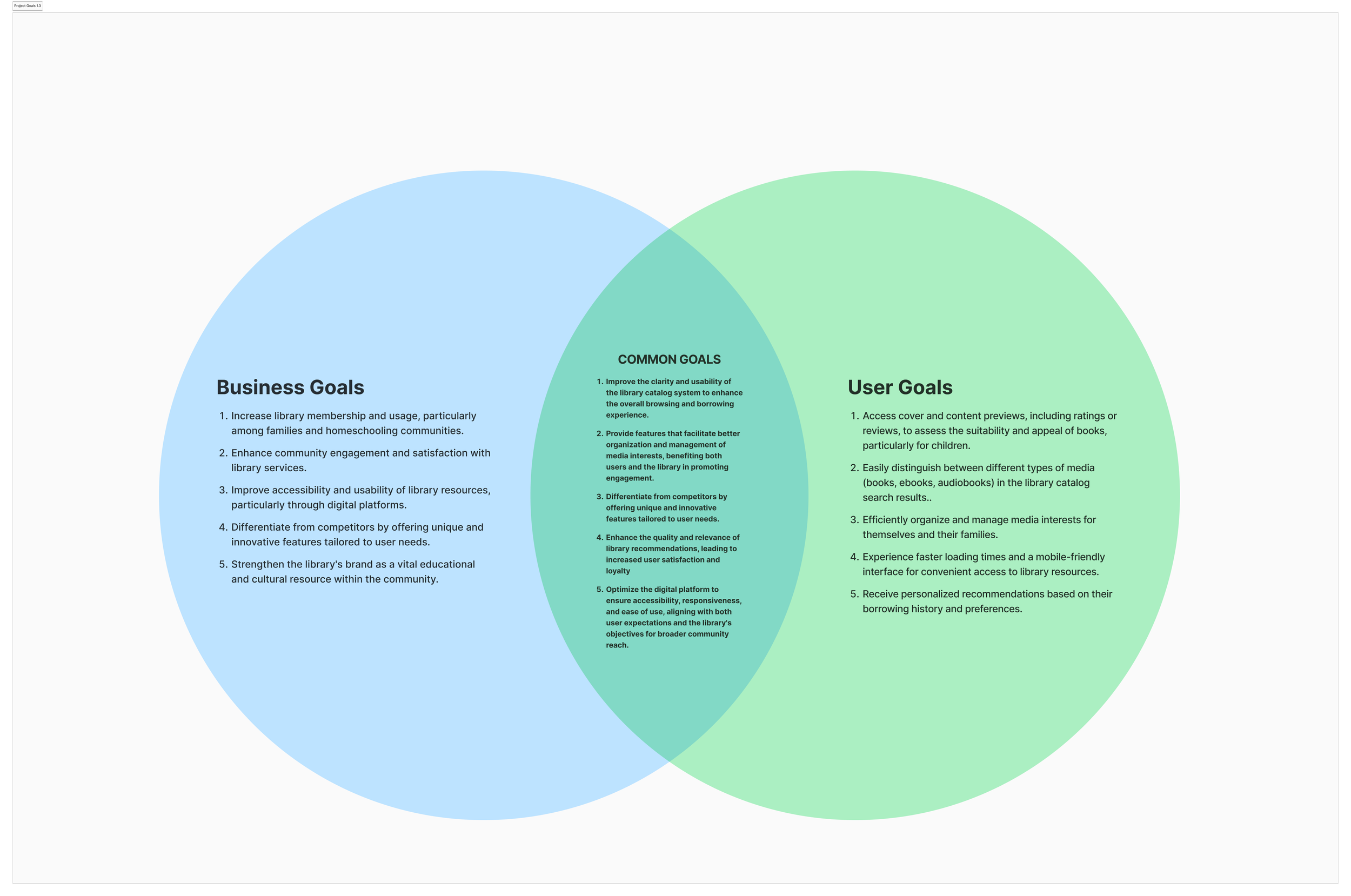
Venn Diagram: After narrowing down the users pain points, I checked back in the Venn diagram create to evaluate alongside the business, user, and common goals. This helped me see that path revealed in the storyboard supported both business and user goals.
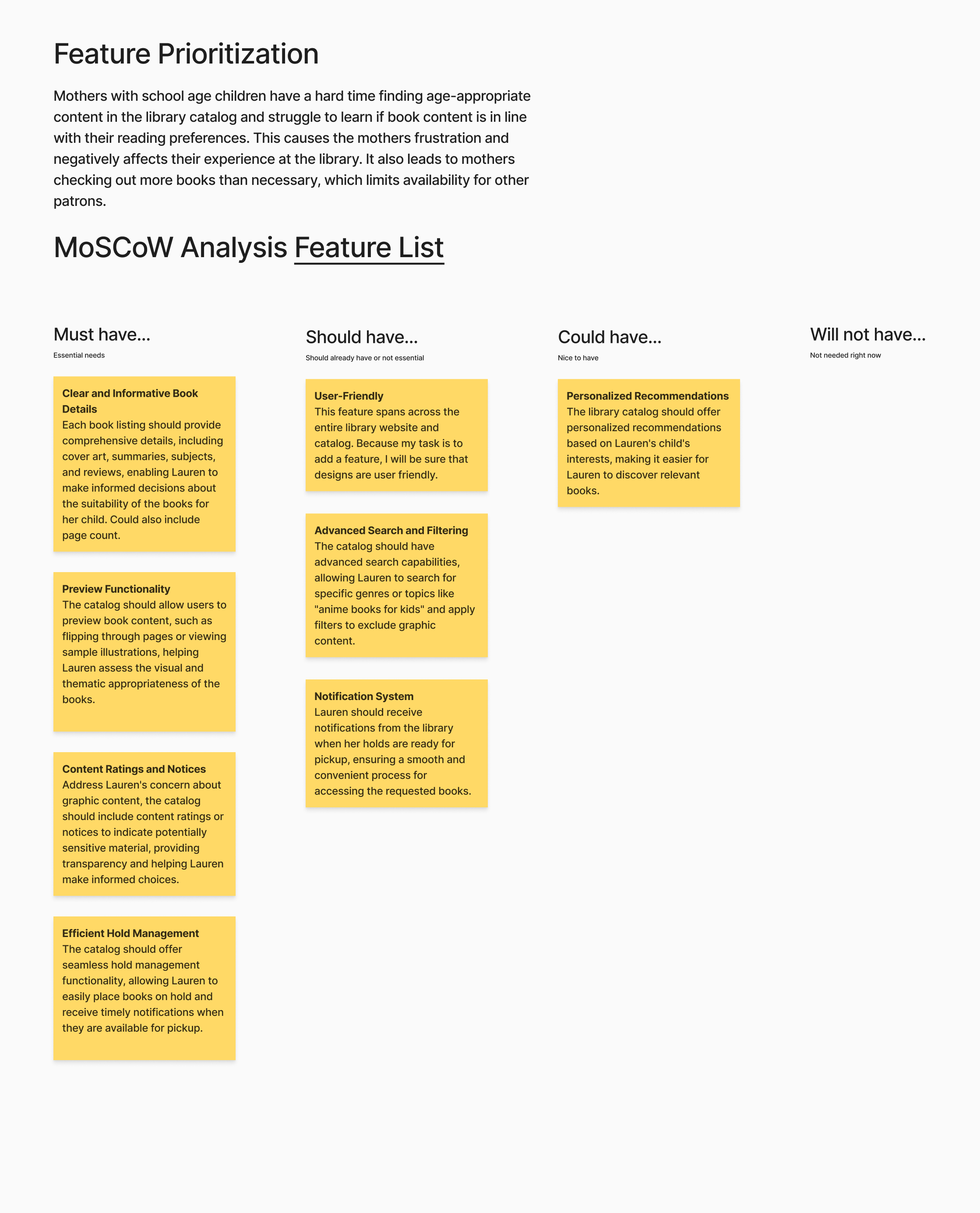
MoSCoW Analysis: Once I identified the features, I prioritized them based on user needs and project scope.
Prioritizing Features
Using the MoSCoW framework, we focused on delivering high-impact features that balance user and business goals:
Must-Have Features: Clear and informative book details, content ratings and descriptions, age recommendations, hold management, and bookmark management.
Deferred Features: Advanced search and filtering, personalized recommendations, and book previews were excluded as they were beyond the project’s scope but could be revisited in future iterations.
Feature Prioritization via MoSCoW Matrix
Narrowing the Scope
The decision to focus on mothers with school-aged children stemmed from direct observation as a frequent library patron. During my weekly visits, I noticed this group is consistently present, making them a significant demographic to support. By addressing their specific needs, the catalog enhancements could have a meaningful impact on a large and engaged user group.
Project Goals
This strategy was built around clear goals to improve both the user experience and the library’s objectives:
Improve Accessibility: Meet WCAG 2.1 AA to AAA standards by enhancing hierarchy, grouping, and color contrast.
Increase Task Completion: Ensure patrons can confidently and successfully use bookmark and hold features.
Boost Catalog Utility: Provide detailed and helpful item information that empowers users to make informed decisions about library materials.
By focusing on this targeted approach, the project delivers meaningful improvements for a key user demographic while laying the groundwork for future scalability.
STEP 3: STRUCTURE THE EXPERIENCE
To reimagine the Buda Public Library catalog and enhance user satisfaction, I approached the project with a structured methodology rooted in research, competitor analysis, and user-centric design principles.
Understanding the Current Flow
I began by evaluating the existing Buda Public Library (BPL) user/task flows for key tasks such as searching for a book, reserving and canceling reservations, and adding or removing items from a book list. This analysis helped identify areas where users were likely to struggle. To gain deeper insights, I compared BPL’s flows with that of competitors, including Austin Public Library, Salt Lake City Public Library, and the Half Price Books website. These platforms provided valuable examples of effective user flows and task processes.
Buda Public Library - Reserve a Book
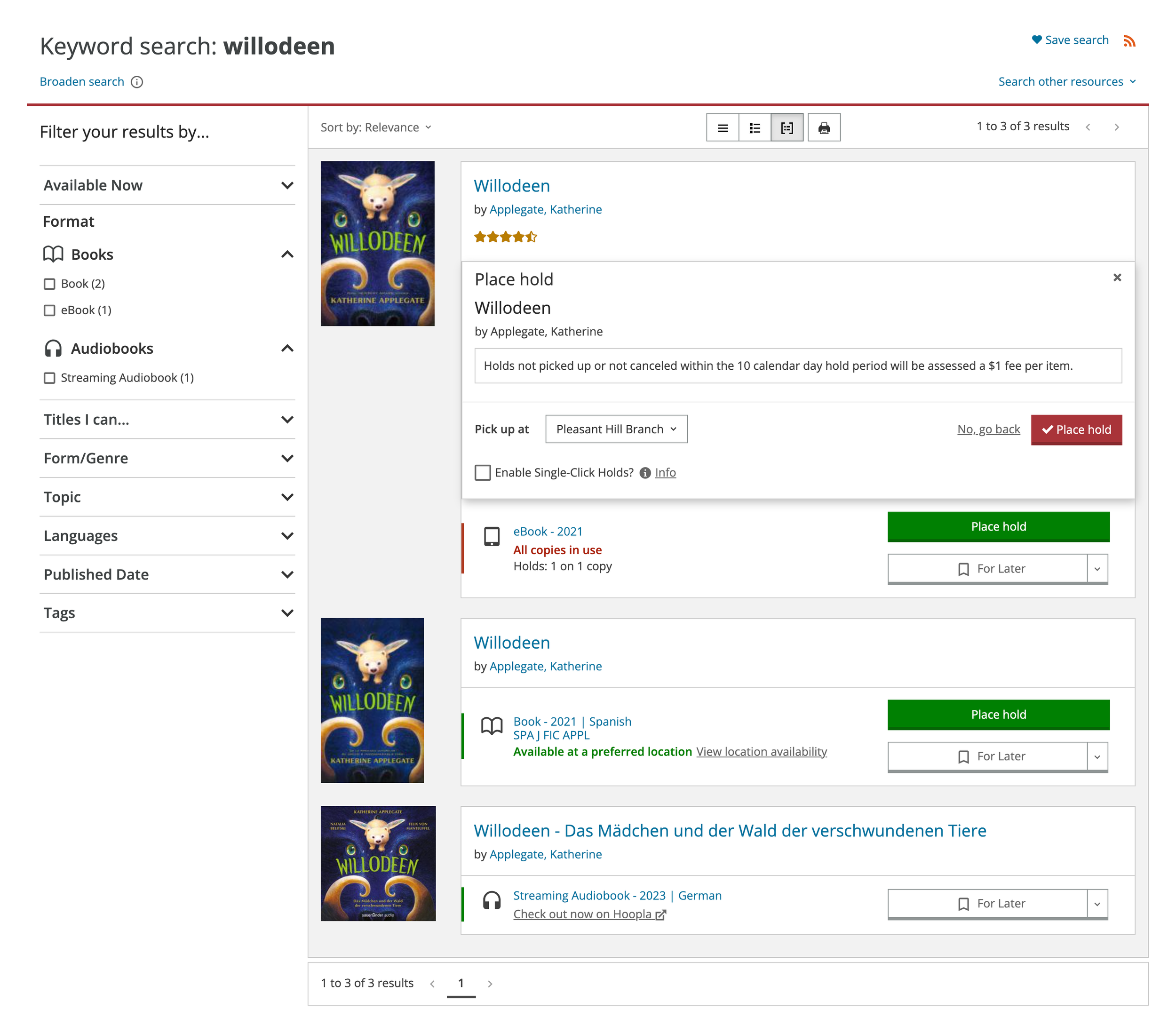
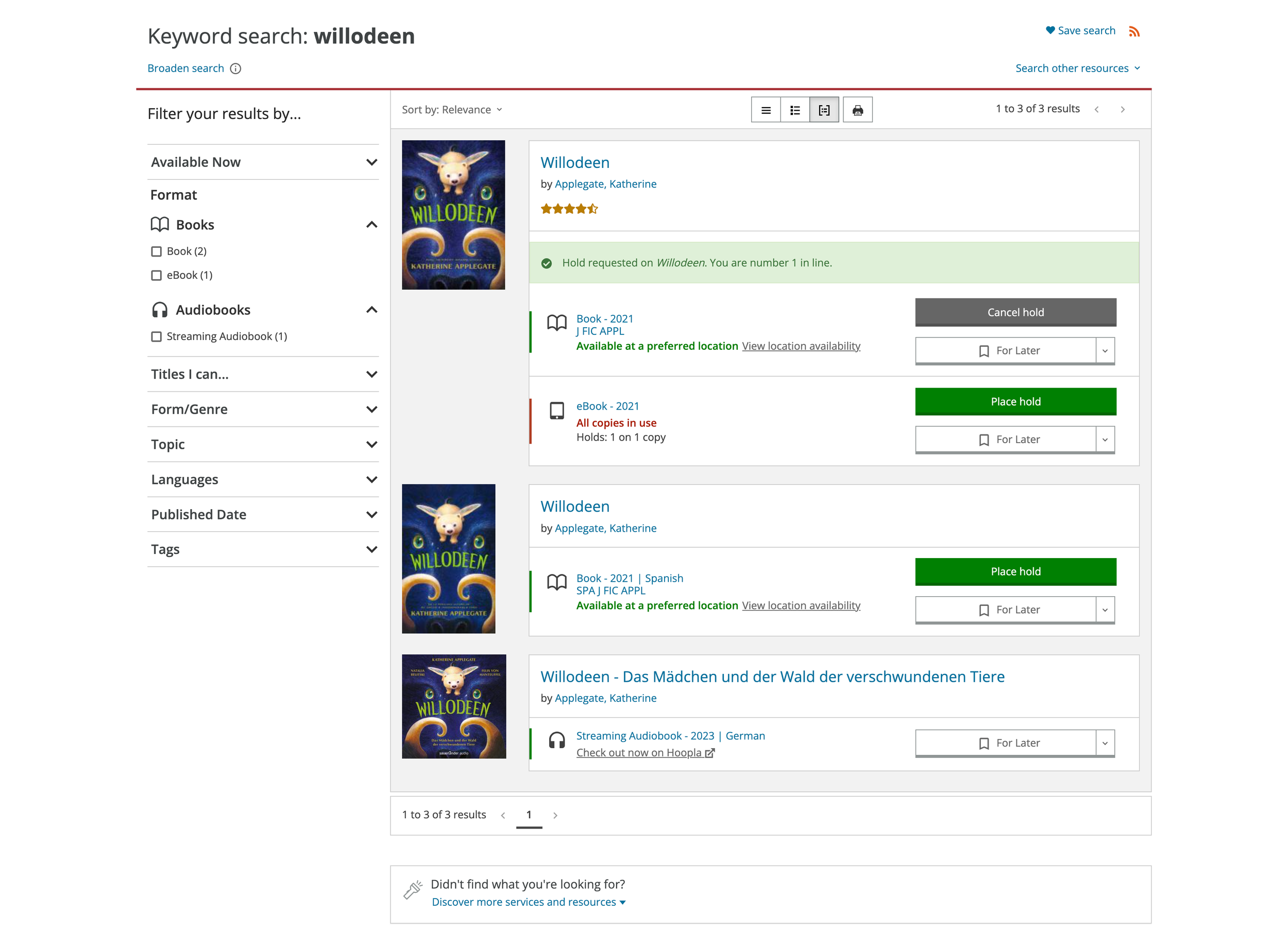
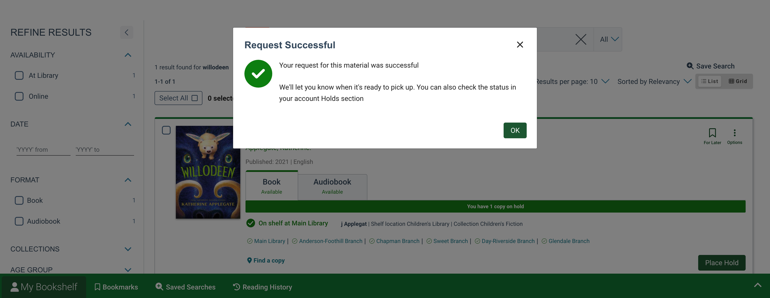
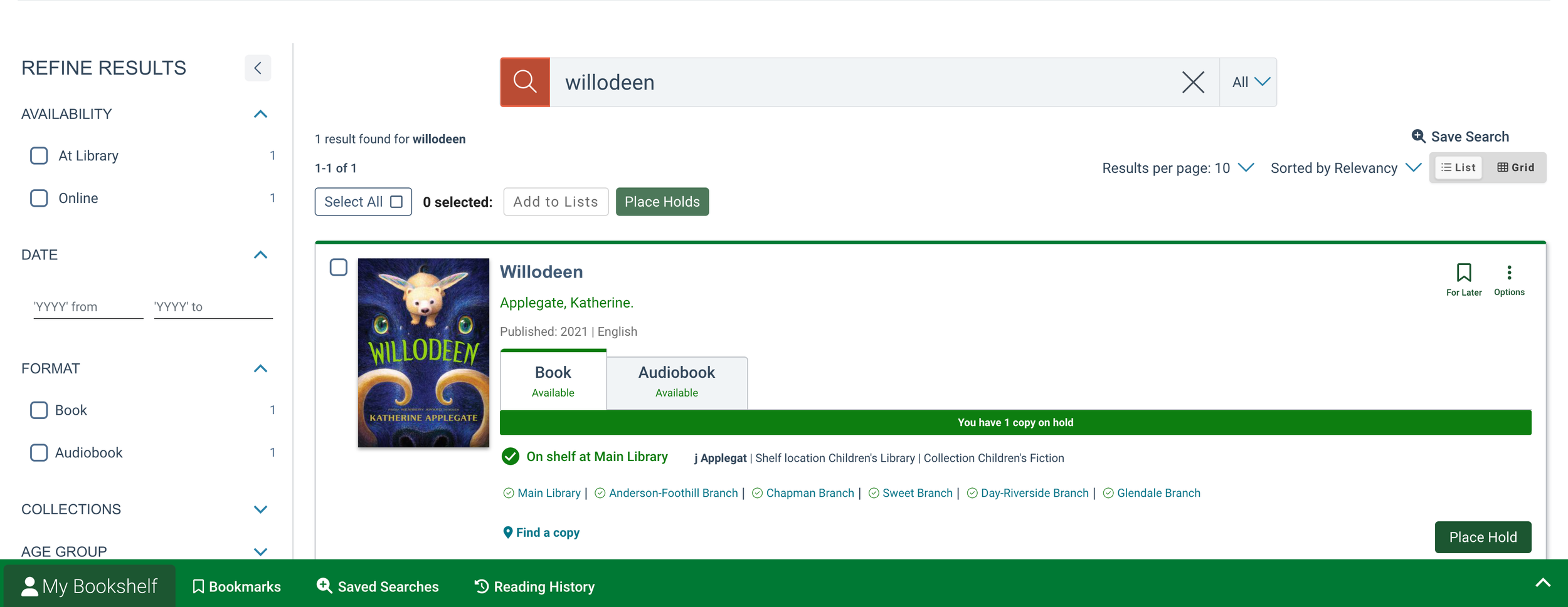
The existing reservation flow at Buda Public Library (BPL) is a simple , but it’s difficult to see the Reserve button within all the text and colors. Book images are small and the content displayed for the library item has very little hierarchy to it. There is only a subtle change in the word on the button that lets the user know their reservation was accepted.
Understanding the Competitor Flow
I evaluated the same reservation flow for Austin Public Library (APL) and Salt Lake City Public Library (SLCPL) and noted the experience was simple, but buttons were easier to identify and the colors used on the page made more logical sense without a color key. Text is more accessible and the user receives clear notification that the reservation was processed. These urban libraries have multiple locations and an additional step was needed for the user to confirm pickup location. I excluded the addition Buda’s catalog designs. I also noted the significantly larger book cover images with both competitors.
Austin Public Library Reservation Flow
Salt Lake City Public Library - Reserve a Book Flow
Designing the New Reservation Flow
After comparing the flows I laid out the current Buda Public Library (BPL) screens in FigJam . Over time, the designed evolved it into BPLs new flow for reserving a book. From there, I identified the screens the screens the user would need to reserve a book using the updated flow.
Designing User & Task Flows
Users needed to perform four primary actions: search for items, bookmark/un-bookmark items, reserve/unreserve items, and learn more about specific items. I referenced competitor workflows to design intuitive task flows that aligned with user expectations. By combining the most user-friendly aspects of flows from Austin Public Library and Salt Lake City Public Library, I created a cohesive design that incorporated both user needs and library requirements.
Addressing Design Challenges
The biggest challenge was merging ideas from multiple sources into a single cohesive design. To address this, I prioritized simplicity and functionality while incorporating the most user-friendly elements from competitors. The resulting design maintained clarity, grouped relevant information together, and ensured consistency in UI patterns.
Targeted Screen Redesign
While navigation bar updates were outside the scope of this project, I focused on redesigning key pages within the catalog.
Search Results Page: Improved how search results are displayed, making it easier for users to identify relevant items.
Main Book Details Page: Enhanced content visibility and interaction for bookmarks, reservations, and item details.
Zoomed - Expanded User & Task Flow v1.2
General Overview: User & Task Flows 1.2
Key Principles
The design approach was guided by four key principles: simplicity, clarity, accessibility, and discoverability. These principles ensured the redesign would address user frustrations, particularly mothers with school-aged children.
Organizing Features and Screens
I organized the updates by prioritizing features based on user importance. To ensure information was easy to identify, I followed the design principle of "chunking," grouping related content together in logical ways.
Users need to be able to easily locate the relevant information and clearly identify the actions they’re able to take on the library catalog screens with minimal effort.
Current BPL Main Book Details
Redesigned Main Book Details for BPL
STEP 4:
DESIGN, PROTOTYPE, TEST & ITERATE
Design Process
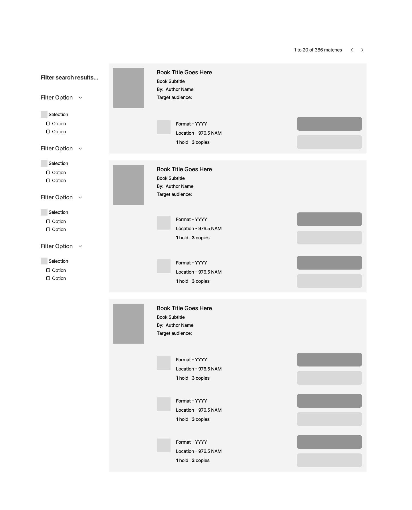
The design process began with a thorough evaluation of the Buda Public Library’s (BPL) current user flows and comparable flows from other library systems, such as Austin Public Library and Salt Lake City Public Library. I started sketching layouts for key screens—the search results page, main book details page, and a reusable confirmation pop-up for reservations and bookmarks. These sketches served as a foundation for low-fidelity digital wireframes created in Figma.
While designing, I adhered to established design patterns from larger library systems, aiming to simplify the visual and interaction-heavy interface. One priority was ensuring that the designs felt intuitive and accessible, catering to a wide spectrum of users. This included addressing visual hierarchy, font sizes, color contrasts, and grouping related information.
By reducing visual noise and improving information placement, I aimed to create an experience that was both user-friendly and aligned with the library’s goals. Particular attention was given to ensuring that the bookmark and reservation icons were easily recognizable and visually reinforced through clear UI feedback mechanisms.
Scalability for Future Designs
Moving forward, the redesigned screens and interaction patterns must be scalable and repeatable across the library catalog. This ensures a straightforward, consistent experience for search results and item detail pages as the catalog grows.
Search Results Low Fidelity Iterations
I sought feedback from fellow designers of all levels when iterating each version. Their feedback helped me make the most of the space on the page and refine content hierarchy while adding more fidelity to the designs. I continually referenced and prioritized user needs for book cover size, hierarchy of content, and easy to identify user actions. Once the main screens were succinct, they’d be ready for user testing.
Main Book Details Low Fidelity Iterations
Prototyping
Prototyping wasn’t isolated to a single phase of the design project. I prototyped as I iterated to ensure the designs worked within Figma’s capabilities. I learned in past design projects that there are several different ways wireframes can be designed and wireframe design affects prototyping capabilities. It was time consuming to prototype early on, but in the end, it made prototyping for testing more efficient because it eliminated the need to redesign large parts of the project for test functionality.
I created clickable interactive prototypes to test functionality at different stages:
Round 1 Prototypes
Low to mid-fidelity prototypes focused on task flows, such as searching for items, bookmarking/un-bookmarking, and reserving/un-reserving books. I tested individual features to gauge user understanding and identify areas for refinement.
Round 2 Prototypes
High-fidelity prototypes connected into a cohesive user flow. These prototypes tested the complete experience, ensuring users could seamlessly navigate from searching for a book to reserving or bookmarking it, and easily accessing the details they needed.
Prototypes do not include keyboard navigation or screen reader compatibility, because I prioritized establishing a foundation for basic accessibility standards like color contrast, text size, and icon clarity.
User Testing Low-Fidelity Prototypes in Maze
Round 1
I conducted 8 tests (6 unmoderated and 2 moderated), recruiting a diverse mix of participants, including book enthusiasts, library users, and individuals less familiar with libraries.
Tasks Included
Searching a specific book and click to learn more about it.
Reserving the book and then canceling the reservation.
Identifying key book details (e.g., synopsis, ratings, media format, and intended audience).
Adding and removing bookmark function for more thorough testing
Post Round 1 User Test - MoSCoW Prioritization
Key Findings
Successes: 100% of users reserved a book and felt confident in the process, while 83.3% successfully canceled reservations and returned to the previous page.
Challenges: 75% of users successfully found a specific book, with some struggling to locate the search bar in the navigation. Additionally, users rated ease of identifying key book details at 3.6/5, citing small text and screen size.
Updates Made
Improved visual hierarchy and reduced cognitive load by grouping related information and increasing font size.
Added persistent bookmarks to the search results and book details pages, with a clear fill indicator for bookmarked items.
Removed redundant confirmation pop-ups for non-destructive actions like removing a bookmark.
High Fidelity Search Results Wireframes
Search Results - No Bookmark
Search Results - Bookmarked
High Fidelity Book Details Wireframe
Main Book Details - No Bookmark
Main Book Details - Bookmark
Main Book Details - Synopsis Dropdown
Evolution of the Pop-Up
Low to High Fidelity Updates
UX Designer feedback indicated that an pop-up could benefit from an indicator to which content the pop-up applies to.
Added a close X and increased margins around the card for breathing room.
Color was added to the button and label text was changed to match library terminology.
Creation of the Confirm Cancellation pop-up was created after the Confirm Reservation pop-up had been refined for high fidelity.
Originally, this popup was replicated for the book mark flow. I didn’t end up keeping the pop-up for the bookmark feature because it it made the flow more complex than it needed to be. The function of deselected was not a destructive enough decision to require extra steps.
Reservation Pop-Up Low → High Fidelity
Low Fidelity Reservation Pop-Up
High Fidelity Confirm Reserve Pop-Up
High Fidelity Confirm Cancel Pop-Up
Round 2
Testing High-Fidelity Prototypes in Lyssna
For more flexible testing this round, I switched to Lyssna, conducting 8 tests (6 unmoderated and 2 moderated).
Tasks focused on validating improvements, including:
Bookmarking/un-bookmarking books from the search results and main book pages.
Locating key book details like intended audience, ratings, and synopsis.
Reserving/un-reserving a book and confirming task completion.
Key Findings
Improvements:
100% of users successfully completed all tasks, including bookmarking, reserving, and locating book details.
First-click tests showed users identified specific details (e.g., synopsis, audience, ratings) within 5–13 seconds, demonstrating clear information hierarchy.
Users appreciated the ability to bookmark and reserve books in multiple locations.
Remaining Feedback: Some users desired even more noticeable feedback to confirm task completion, leading to refinements in the notification banner and icon indicators.
Iterations & Refinements
After Round 2 testing, I implemented the following refinements using the MoSCoW prioritization method:
Increased the size and color contrast improvements of the notification badge for "My Account" to enhance visibility.
Improved grouping of the intended audience details to strengthen content hierarchy.
Updated the notification banner for reservations and bookmarks, ensuring clear, immediate task confirmation.
Notification Dot Evolution
Final Results
The iterative design process and user testing led to a polished catalog interface:
100% of users could successfully search for items, view detailed information, and bookmark or reserve/unreserve books.
User satisfaction and confidence significantly improved between rounds.
The final design simplified the user experience, improved readability, and streamlined task flows without introducing unnecessary complexity.
Key Takeaway from Testing
The biggest insight from this process was recognizing that even when designs test well initially, there’s always room for improvement. Each iteration refined the design further, ensuring it met both user needs and library goals while maintaining accessibility and usability.
The notification badge is a beneficial feature for the user experience, but the space within the current navigation bar is very limited. To work around this I made the badge as large as possible given the available space, designed so that the badge did not interfere with other functions in the bar, then, I added a white outline to the outside to improve the color contrast for accessibility.
STEP 5: USER INTERFACE
Overview
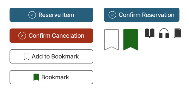
The library branding for Buda Public Library (BPL) is already established so I focused on keeping with existing text and button designs. I repurposed BPLs red and green colors to clearly indicate when user tasks had been completed or undone, like when the user cancels an item reservation. I added a large icon for the bookmark, in button for the reserve function, and a book icon to accompany the media type. For icons, I used free resources that matched the library’s online aesthetic and I chose the icons that are easily identifiable.
Expanded UI Color Palette & Contrast Accessibility
Button States
Buttons & Icons
STEP 6: FINAL ITERATIONS & PROTOTYPE
Final Prototypes
Bookmark from Search Results
This prototype is active for Witch Hat Atelier vol. 1 only.
Bookmark from Main Book Screen
After bookmarking, check to confirm the task was completed.
Reserve & Cancel Reservation
This prototype is active for Witch Hat Atelier vol. 2 only.
May reserve Witch Hat Atelier vol. 2 from the search results page or by navigating to the main book page.
Before & After
Before/After Search Results
Before/After Main Book Detail Screens
Outcomes
The Buda Public Library catalog redesign achieved its primary goal of creating a more user-friendly, intuitive, and visually accessible experience. By focusing on user-centered design, iterative prototyping, and rigorous testing, the project delivered meaningful improvements across several key areas.
Key Accomplishments
Improved Usability and Task Completion:
100% of users successfully searched for books, accessed detailed information, and completed actions like bookmarking/un-bookmarking and reserving/un-reserving books by the end of testing.
User satisfaction scores increased across testing rounds, with participants noting the streamlined navigation and improved hierarchy of information.
Enhanced Accessibility and Visual Design
The final designs incorporated accessible features such as larger text sizes, increased color contrast, and grouped content to reduce cognitive load.
Persistent bookmarks and clear visual indicators provided users with real-time feedback, ensuring clarity and confidence in task completion.
Streamlined Task Flows:
The reservation and bookmarking workflows were simplified through reusable design patterns and reduced redundant steps, such as removing unnecessary pop-up confirmations.
The addition of a persistent bookmark indicator across pages offered users multiple touch-points for engagement, enhancing convenience and usability.
Validation Through Testing:
Iterative testing across two platforms (Maze and Lyssna) allowed for diverse feedback and ensured flexibility in refining the design.
First-click tests demonstrated the success of the updated hierarchy, with users consistently locating key book details (e.g., synopsis, intended audience, and ratings) in under 10 seconds.
Design Insights
Hierarchy Matters: Testing revealed the importance of designing clear visual hierarchies for content-heavy pages. Refining typography, spacing, and content grouping significantly improved the user experience.
Action Feedback Is Essential: Small but meaningful changes, like filling bookmark icons and enhancing notification banners, helped users feel confident their tasks were completed.
Iterative Refinement Is Key: Even when initial designs performed well, additional rounds of testing highlighted opportunities to elevate the design further. Each iteration brought measurable improvements in user satisfaction and performance.
Reusability Reduces Complexity: Designing reusable components, such as a universal pop-up for bookmarks and reservations, minimized cognitive load and created consistent user interactions.
Impact on the Library’s Goals
The final design serves as a scalable solution tailored to the Buda Public Library’s needs and resource constraints. By balancing simplicity with functionality, the redesign improves the library’s ability to engage a broad spectrum of users, from avid readers to first-time visitors, and supports its mission to make library resources accessible and welcoming to all.
Key Challenges
One of the biggest challenges in this project was managing time constraints as a new designer while navigating the complexities of the library catalog system. The catalog's interconnected nature meant that changes to one feature could ripple across other areas, requiring thoughtful consideration and testing to ensure consistency. Additionally, existing accessibility issues within the navigation and search bar posed a challenge when trying to incorporate features like a notification icon. With limited space and rigid design constraints, I had to prioritize user needs while working creatively within these limitations.
The badge notification dot used in the navigation bar is too small. Unfortunately, the narrow navigation bar and it’s dark color make make it difficult to improve accessibility to where it should be. Most testers didn’t notice the badge until they were asked about it. With that said, adding the badge gives the user an additional way of knowing that a particular task was completed— which adds value to the user experience.
Lessons Learned
This project taught me the value of diverse feedback and the importance of balancing user needs with stakeholder requirements. User testing feedback provided invaluable insights into usability, while suggestions from design mentors illuminated areas of opportunity I might have missed. For example, the idea to add a notification icon came from my mentor and ultimately enhanced the user experience by offering multiple visual confirmations of completed actions, such as reserving a book. This reinforced the importance of collaboration and staying open to new ideas, especially when working deeply within a design. Creation of the notification badge also taught me that sometimes as a designer, you have to work within strict parameters because of existing design patterns that cannot be changed. In these instances, I can still make the most out of what I have to work with.
Another key lesson was the need to establish benchmarks when redesigning an existing system. Looking back, I realized that testing participants in the original Buda Public Library setup would have provided a clearer comparison point for assessing the impact of my redesign. Benchmarking would have allowed me to better quantify improvements and identify additional areas for refinement.
Next Steps
Moving forward, I plan to take several steps to build on this project and ensure the design fully meets the needs of all users and stakeholders.
Stakeholder Consultation: Consult with librarians and city officials to understand the essential information they require on catalog pages. This step will help bridge the gap between patron needs and administrative priorities, ensuring the design serves all users effectively.
Accessibility Enhancements: Redesign the navigation and search bar to address existing accessibility issues. Improvements may include adjusting layout and spacing, simplifying interactions, and enhancing visual clarity to create a more intuitive and inclusive experience. I also recommend resolving accessibility and integrating recent design patters for the What’s Hot section on the catalog homepage as a way to bring designs from both phases together.
Iterative Testing: Continue testing and iterating on the updated navigation and search bar designs to ensure usability improvements align with user expectations and meet accessibility standards. In these iterations, we know to leave enough room for a larger, more color-accessible notification badge.
By addressing these next steps, I aim to build on the foundation of this project, delivering a library catalog that serves the needs of a diverse user base while supporting the goals of the library staff.


