A Mobile-First Website Design Rebrand for a Private Piano & Voice Lesson Business
Phase 1
This case study is a work in progress— last updated on January 12, 2025.
A# Studio is a small business in Georgetown, Texas, dedicated to inspiring a lifelong love of music in young children through piano and voice lessons.
Project Scope
Role
UX Designer + UI Designer
Timeline
Phase 1 - 14 weeks
Skills
User Research, Information Architecture, Wireframing, Visual Design, User Testing, Prototyping
Tools Used
Chat GPT, FigJam, Figma, Lottie Files, Lyssna, Maze, Pexels, Supernormal
What I Did
Competitive Analysis, User Research, Information Architecture, Web Design, Feature Improvement, Usability Testing, User/Task Flows, Wireframing, Interaction Design, Prototyping, & Branding
Project Origin Story
With a mission to foster creativity, confidence, and personal growth, A# equips its students with the tools to explore music both in lessons and at home.
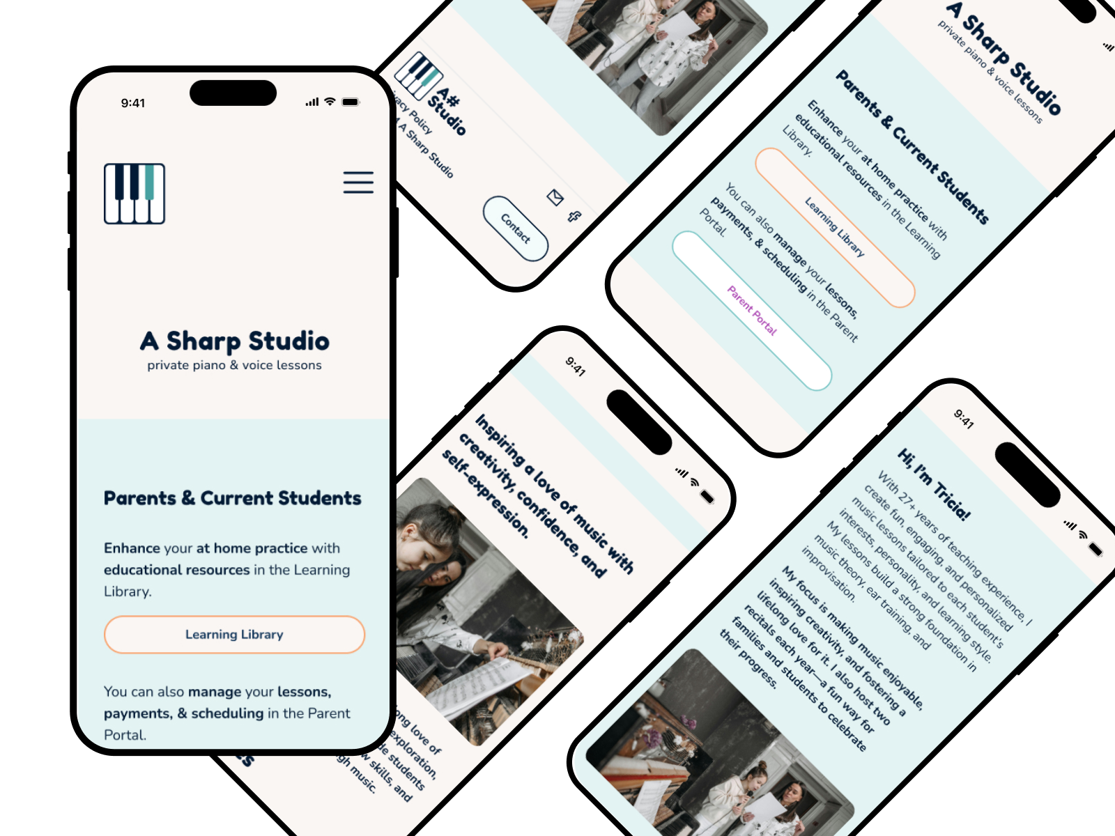
The mobile-first website and branding aimed to give A# Studio a visual identity and digital platform to showcase its services while providing educational resources to support students’ at-home practice. Designed with the studio owner’s personality and goals in mind, the project makes it easier for the studio owner to connect with prospective clients and add value for current students and their families.
The Problem
After speaking with the studio owner, we discovered a number of challenges, but a few things bubbled to the top. The studio needed a tangible brand identity and an online presence as a service-oriented business.
Building the brand without any input from A#’s parents and students posed a unique challenge that I overcame through creative research. This helped me make informed design decisions that appeals to parents and their music students.
The Hypothesis
If we design a mobile website and brand for A# Studio that primarily caters to parents of young students while remaining inclusive for older students and adults, we believe the studio will better support its existing clients. By providing curated, teacher-approved resources for at-home practice, the website can help parents guide their children’s musical growth with confidence and ease. A thoughtful, professional design will ensure all students—young and old—feel supported while positioning A# Studio as a trusted and leading music educator in Georgetown, TX.
The Solution
To address A# Studio's need to better support existing clients, we designed a mobile-first website that integrates teacher-approved resources and provides parents with the tools to guide their children’s at-home practice. Starting with the studio’s largest group—piano students—we expanded on the studio’s existing video library and introduced a beginner music terminology card game as an interactive learning tool.
Next phases of the design include incorporating additional features like testimonials, a services page, an FAQ, an about section, and contact information, were carefully curated based on insights from user research and teacher input.
Visually, the branding reflects the colorful & warm, creative atmosphere of A# Studio’s private studio space. A vibrant orange paired with the business owner’s favorite teal creates a welcoming and professional aesthetic. Real photography of people adds a sense of connection, helping parents and students see themselves in the space. The design also incorporates minimal pops of color to match the colorful personality of the studio.
By integrating A# Studio’s existing client portal into the website and establishing a clear, approachable online presence, the brand design supports current students but also positions the business as a trusted music educator within the studio’s community. The project successfully overcame challenges, including limited access to client feedback, by relying on thorough user research and creative design strategies.
The Validation
The design process for A# Studio included three rounds of user testing to ensure the website effectively served its primary audience. In the initial round, users rated task completion difficulty at an average score of 2.57/5, with 1 being the easiest. By the final round, iterative improvements increased the average score to 3.33, demonstrating significant progress in usability.
User feedback highlighted key successes, including an intuitive site flow and clearly labeled resources. One tester noted, “It was very easy to see where to go to practice beginner terminology. Everything was clearly labeled. I like the small interactions (like the fireworks).” However, there were also challenges, such as the drag-and-drop feature in the prototype, which required refinement.
Perhaps the most valuable validation came from aligning the project’s focus with the music teacher’s priorities. Initially, the website was assumed to target potential clients, but discussions with the teacher shifted the goal to supporting and retaining existing students. The final design succeeded in creating a welcoming, professional support hub, blending the studio’s offerings with what parents and students can expect from A# Studio.
The Impact
The new website and branding for A# Studio create a vital foundation for supporting both students and their parents. By offering helpful, teacher-approved resources for at-home practice, the design empowers parents to actively support their children’s musical growth. Though hypothetical, the website concept positions A# Studio as a trusted, professional presence in the Georgetown, TX community, creating a digital footprint that aligns with the studio's dedication to fostering creativity and skill-building in its students.
For the teacher, the website provides a central hub to streamline communication and lesson management for parents, making it easier to support her existing clients. As a scalable platform, the website lays the groundwork for future growth, ensuring the studio can continue to enrich its students’ musical journeys while enhancing the experience for parents and the business owner alike.
Goals / KPIs
Improve Information Accessibility
These metrics focus on ensuring that parents can make informed decisions quickly and easily, addressing their desire for clear and transparent communication about lessons.
90% of users should be able to easily find their way to the resources page.
75% of users should report that the website clearly communicates the teacher’s experience, qualifications, and teaching philosophy
Enhance Learning Resources for Existing Clients
These metrics prioritize the studio’s goal of supporting current clients by providing valuable resources to reinforce lessons and encourage successful at-home practice, fostering greater student progress and satisfaction.
80% of surveyed parents should report that the resources (e.g., videos, practice guides, interactive tools) help their child practice more effectively at home.
Enhance Credibility and Trust
These metrics aim to establish A# Studio as a credible and professional choice, meeting the expectations of both prospective and existing clients.
Include at least 5 high-quality testimonials prominently on the site, with 90% of surveyed users stating that testimonials positively influenced their perception of A# Studio.
Showcase a visually appealing and professional design that 85% of users agree enhances trustworthiness and reflects the teacher’s expertise.
The Design Process
Step 1 - Research & Discovery
Discovery: Owner interview, user interviews, and secondary research, including a broad competitive analysis.
Synthesizing Insights: Affinity mapping to uncover problems and potential solutions from the data.
Step 2 - Define the Problem & Strategy
Problem Framing & Ideation: "How Might We" questions to guide creative thinking.
Step 3 - Structure the Experience
Information Architecture: Structuring content and navigation.
sitemap, menu (navigation) hierarchy
Core Flow Design: Design & refine the primary breath exercise components, and discover prototype capabilities
Design User & Task Flows
Step 4 - Design, Test & Iterate
Round 1: Low → Mid Fidelity Wireframes
User Testing, Feedback Synthesis & Iterations - Round 1
Round 2: Mid → High Fidelity Wireframes
User Testing, Feedback, Synthesis & Iterations - Round 2
Step 5 - Branding & UI
Develop the brand and user interface design
Step 6 - Final Iterations & Prototype
Final High Fidelity Wireframes & Last Iterations: Refine, organize, and prepare final wireframes.
STEP 1 - RESEARCH & DISCOVERY
Research and discovery for A# Studio provided key insights to create a user-friendly, authentic website. By analyzing competitors, conducting interviews, and exploring tools like Simply Piano, we identified ways to showcase the studio's unique value while meeting student and parent needs. This guided us in designing a visually engaging and functional website that supports A# Studio's goals, mission, and branding.
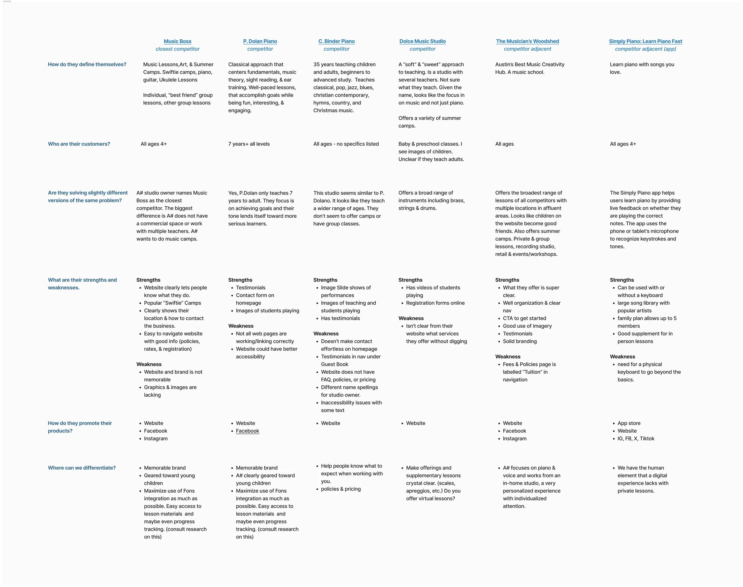
Competitive Analysis
Music Boss - A brick and mortar studio offering piano, guitar, uke, and art lessons located in Georgetown, TX. According to A# studio owner, this is their closest competitor.
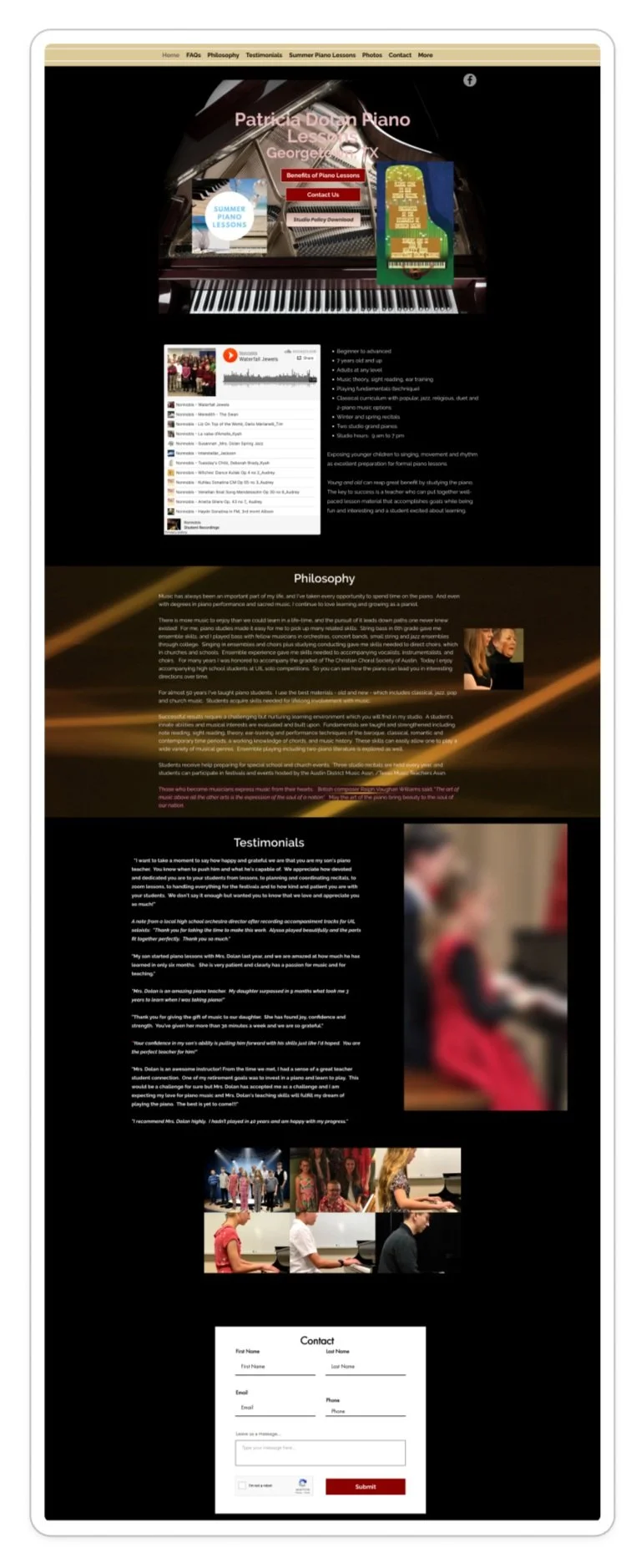
P. Dolan Piano - An experienced piano teacher in Georgetown who uses a traditional/classical method of teaching.
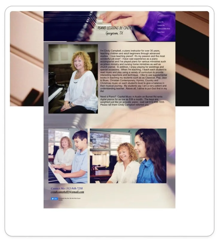
C. Binder Piano - A experienced piano teacher in Georgetown.
Dolce Music Studio - A Georgetown based music studio offers a variety of music lessons specific to voice, piano, folk rock, praise, jazz, and chamber styles of music.
The Musicians Woodshed - A large studio in a neighboring community that offers a wide variety of music and voice lessons.
Simply Piano - a piano that aims to help users learn piano with fun and speed.
Project Impact
This extensive competitive analysis helped us get to know what the competition is like where the A# studio is located. There were several other competitors in Georgetown who taught piano that didn’t have a website.
I evaluated the type of information each competitor put out for their use studio, which could be compared later with what users needs. We also learned about their user expectations. For example, music teachers had a teacher qualification, studio policies and practices, pricing, etc. were all common.
The analysis also helped identify areas where A# could differentiate from the competition and also as a benchmark for website usability and functionality. I immediately recognized improvements to accessibility, quality and organization of content, branding, user friendliness, and resources for students and parents.
I looked to the competition for inspired design ideas and features that lend themself well to A#’s brand and users.
Competitor SWOT Analysis
User Interviews
6 Phone Interview Participants
1 was A# Studio Owner, Tricia. Questionnaires & a phone interview helped me learn about the studio more in depth
1 Participant had taken piano lessons as an adult years ago. This parent was also interested in enrolling their child in lessons.
1 parent to a child who has been actively taking lessons for 10 months.
1 parent had never taken lessons, but was interested in enrolling his child
We also interviewed 2 participants, aged 8 & 9, who are currently taking lessons or interested in lessons.
Additional User Demographics
Synthesized Interview Insights & Project Impact
A# Studio Needs
Does not want studio policies online - The owner prefers to discuss policies over the phone with prospective clients.
Doesn’t want to give access to clients for interviews
Primary business goal is to support existing students, not to generate new clients, as services are fully booked and waist listed.
Authentic branding that speaks to who Tricia is as a person and music teacher. She loves vivid blue/greens and her studio space gives off perfectly balanced victorian vibes with a colorful array of peacock colors and crystals. Tricia teachers students of all ages and abilities and she accepts students age 4+. She loves working with kids.
Parents or Adult Student Needs
What to expect from taking lessons with the specific teacher or school.
The website must address needs upfront, clearly. Parents want a higher level overview of how lessons are structured.
Age and ability centered, well-rounded learning that is includes scales, arpeggios, transposing, and fun music.
Parents value the recitals as it brings them lots of joy to see their childs growth.
Cost and time considerations
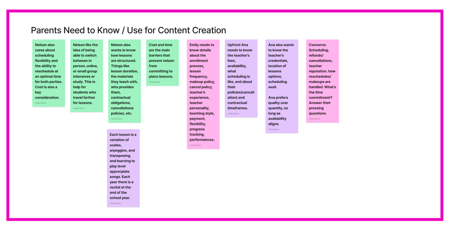
Cost and time (scheduling flexibility) are the main barriers for committing to piano lessons.
Scheduling flexibility and optimal rescheduling times are important considerations.
Teacher credentials and policies
Students are interested in teacher credentials, lesson structure, materials used, and cancellation policies.
Ana & Nelson prioritizes quality over quantity and values availability alignment.
Flexibility in lesson options
Nelson is interested in flexibility between in-person, online, or small group lessons.
Flexibility in scheduling and rescheduling is important, along with cost considerations.
Practice resources
Short practice videos and music books are helpful for at-home practice.
Emily finds visual aids like images to be beneficial for practice.
Ana suggests supplement materials to help kids remember music terms, like 'transposing'.
Guidance when buying instruments or other lesson related materials.
Parents want support or guidance to establish practice routines at home.
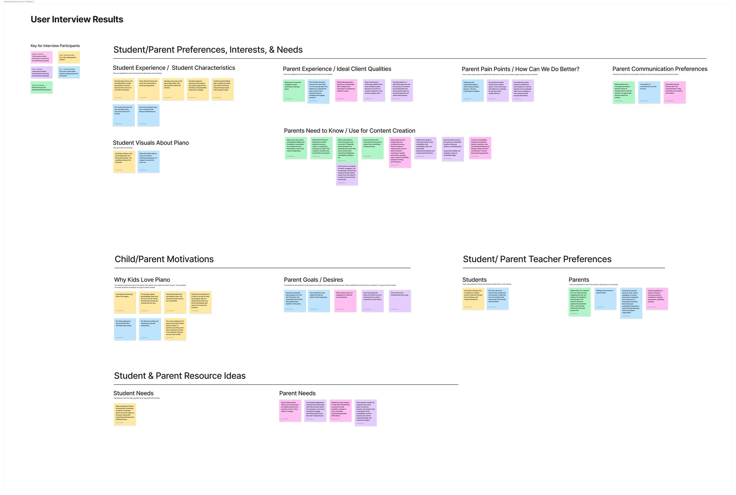
Full Zoom - User Interview Affinity Map Synthesis
Focused - User Interview Affinity Map Synthesis
High Level Overview - Affinity Map Synthesis
Simply Piano Research
Simply Piano features that support student learning include: real-time feedback on played notes, visual representations of the keyboard, color-coded guidance for correct notes, a progressive lesson structure with increasing difficulty, a wide range of songs to learn from, personalized practice options, and the ability to learn at your own pace; essentially acting like a virtual piano teacher that listens to your playing and provides immediate feedback to help you improve accuracy and technique.
Key features
Gamification Elements: Incorporates game-like features like points and rewards to motivate learners.
Instant Feedback: The app listens to the notes you play on any piano or keyboard and provides immediate feedback on whether you're playing the correct notes, highlighting mistakes in real-time.
Visual Keyboard: A visual representation of the piano keyboard on the screen helps users identify the correct keys to play, especially for beginners.
Color-Coding: Notes are color-coded to indicate whether they are correct or incorrect, providing visual guidance during practice.
Gradual Progression: Lessons are structured to gradually increase in difficulty, allowing students to build skills progressively.
Diverse Song Library: Access to a large selection of songs across different genres, from classical pieces to popular hits, to keep learning engaging.
Customizable Practice: Ability to practice specific sections of a song or focus on challenging parts.
Progress Tracking: Monitors your progress over time, allowing you to see how your skills are developing.
Research Phase Project Insight
This project was grounded in extensive qualitative and quantitative research, ensuring that every design decision was backed by a deep understanding of user needs. Through a combination of user interviews, unmoderated testing, surveys, competitive analysis, and affinity mapping, we uncovered valuable insights about parents, students, and the competitive landscape of music education. We explored parents’ pain points, their communication preferences, and the essential information they need when choosing a music teacher. Additionally, we examined the digital presence of competitors to identify industry trends and opportunities for differentiation.
The research revealed that parents highly value teacher-approved resources to support their children’s at-home practice, which informed the inclusion of tools like a music terms card game in the final design. These findings guided every aspect of the branding and website redesign, from creating a welcoming and professional visual identity to ensuring the platform met both practical and emotional needs of prospective clients. By placing research at the heart of the process, the new design empowers A# Studio to connect meaningfully with families and foster their love of music.
Research Phase Impact
We learned everything we needed to know to create authentic A# studio branding elements
We had a list of ideas on how to make designs that are user friendly and valuable from music students, their parents, and competitors.
We learned what A#, parents of music students, & music students needs so we could design the website for their unique needs.
Venn Diagram Business & User Needs
STEP 2: DEFINE PROBLEM & STRATEGY
Research revealed key pain points, such as parents needing more actionable resources to reinforce their child's learning and the critical need for clear, easily accessible information to help families make informed decisions. To address these challenges, we crafted a strategy focused on providing practical tools, streamlining access to essential information, and fostering a stronger connection with the teacher’s approach. This strategy would help the studio support students and their families both inside and outside of lessons, enhancing the overall experience for everyone involved.
How might we better support A# parents and students with their at home practice from our website?
Parents need actionable resources: Families often struggle to reinforce learning outside of lessons. Parents desire practice tools to support their children effectively.
Clear and accessible information is critical: Parents prioritize ease of access to information, such as teaching philosophy, lesson structure, and scheduling policies, to feel confident in their decision-making.
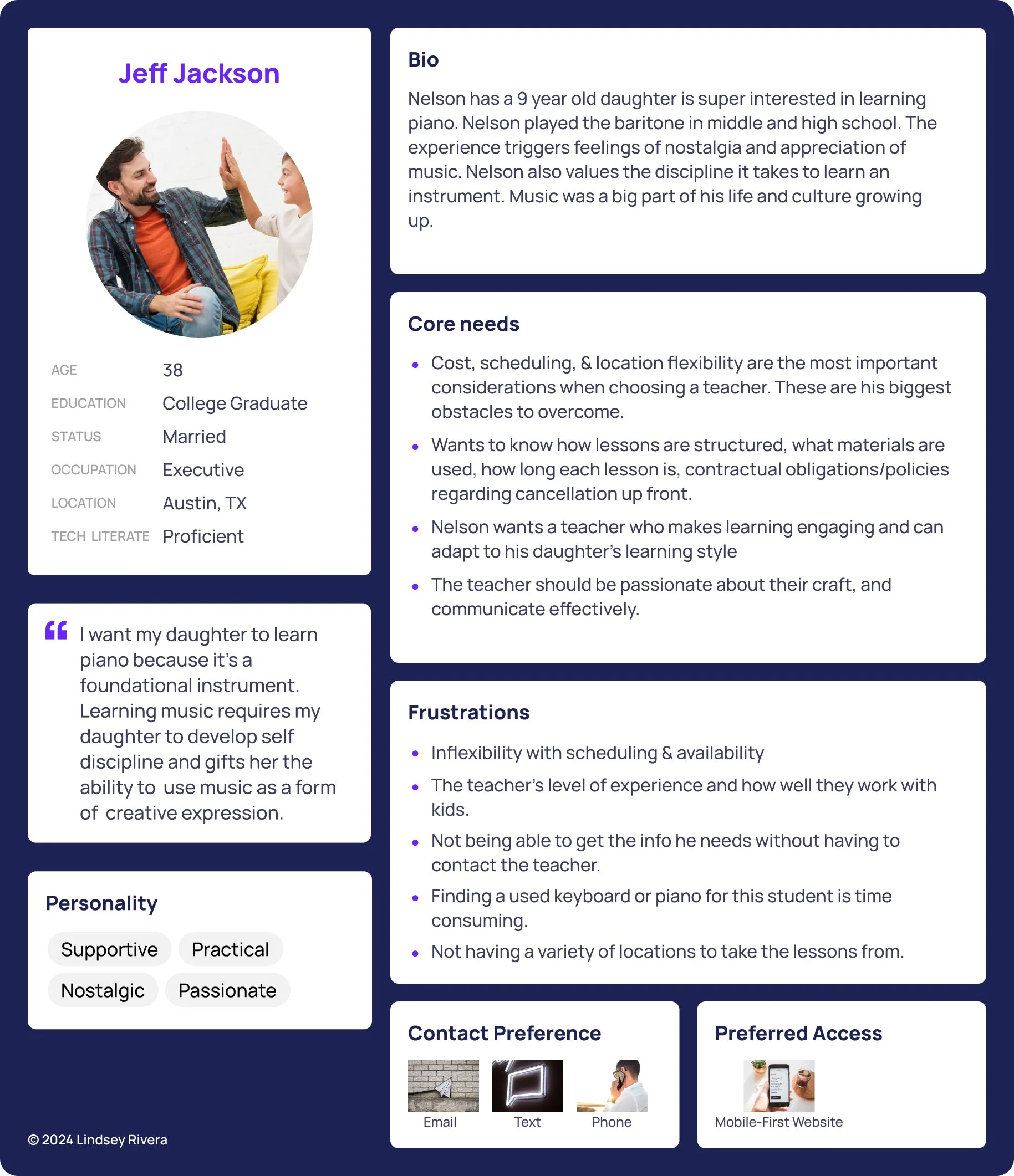
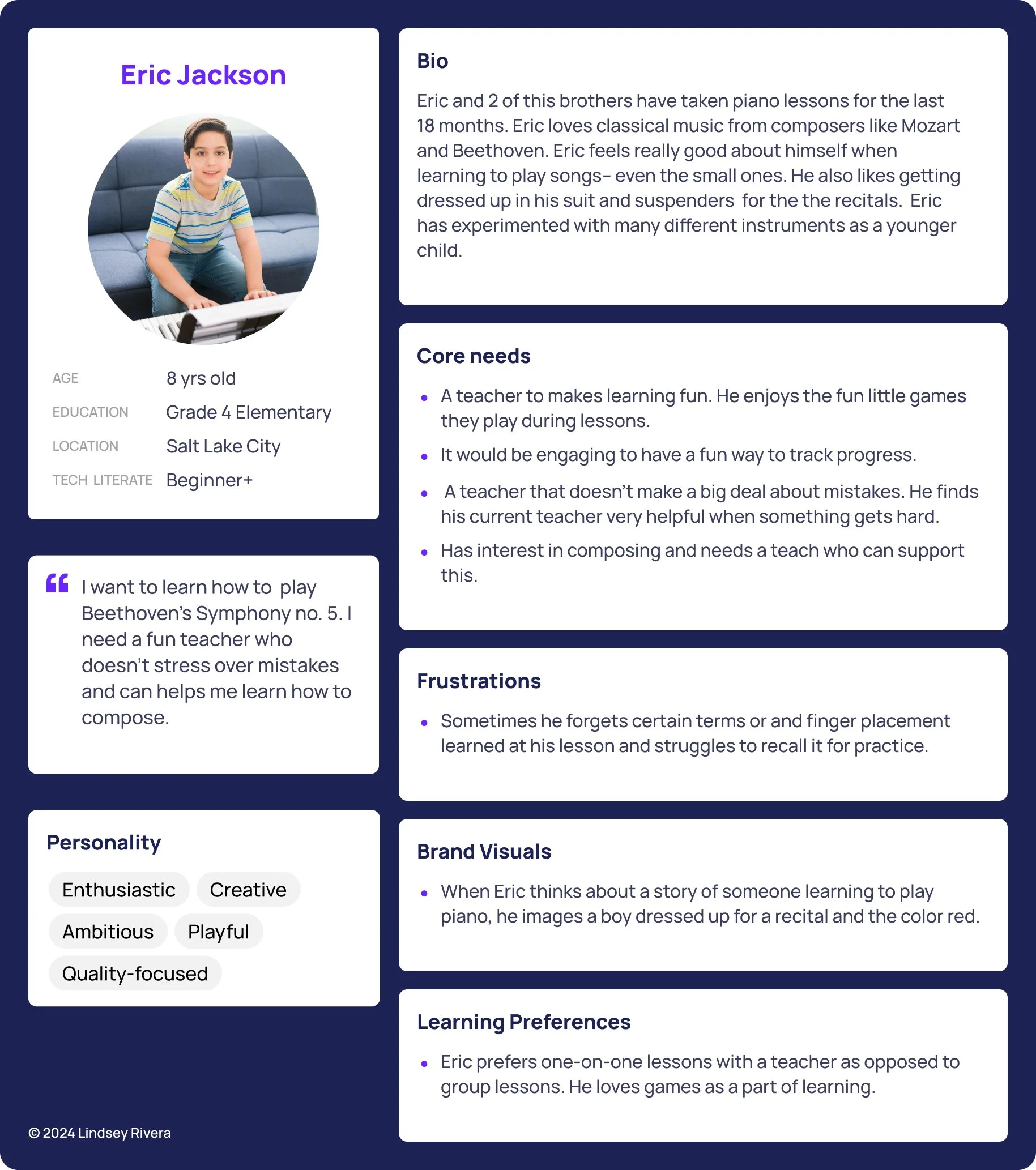
User Persona 1
User Persona 2
User Persona 3
Defining the Problem
Parents want to play an active role in their child’s piano education but often lack the tools and guidance to do so effectively. A# Studio’s website had an opportunity to bridge this gap by serving as a centralized hub for practice resources and essential information.
According to the research it was decided to also included a unique differentiating feature for A# Studio website— a beginner music student card game to help the students practice their musical terms.
Strategy
To address this problem, we defined a strategy built around three core objectives:
Provide Comprehensive At-Home Practice Tools: Design a resource library featuring helpful interactive resources tailored to common students’ needs.
Streamline Information Accessibility: Ensure essential information—like teaching philosophy and what parents/students can expect is easy to find with minimal clicks
Enhance Credibility and Connection: Use testimonials, visuals, and a polished design to establish trust and convey the teacher’s approachable and personalized teaching style.
Feature Set Ideas
STEP 3: STRUCTURE THE EXPERIENCE
In this phase, the goal was to create a website and interactive learning tool that aligned with A# Studio's mission to better support its students and parents while maintaining a balance between functionality and simplicity. This stage focused on building the foundation for a seamless and engaging user experience.
Defining the User Experience
The primary focus for the website was providing existing clients—parents with enrolled students. The goal, to provide them with resources to improve at-home practice. The first resource we are focusing on is a card game to help beginner students practice their music terminology.
To address current user needs, we prioritized building a Learning Library, with a central feature being an interactive terminology card game. This game was designed to help beginner students, the studio’s largest demographic, practice and retain music terms.
A secondary goal of the website is to introduce potential clients to A# Studio and its teacher.
Resource Organization 1.1
Resource Organization 1.0
Information Architecture and Navigation
I started to give the website some structure using a high-level sitemap, iterating on the organization to refine the information architecture (IA). This included defining content groupings, hierarchical structure, and labels for each screen.
Key considerations
Prioritizing Current Clients: As the primary audience, parents needed easy access to resources. Therefore, the website's current phase did not include sections such as "About the Teacher", Studio Policies, and Testimonials, as they support new clients. The studio own also didn’t want policies on the website.
Publicly Accessible Resources: To maximize usability and access, resources are not password-protected or restricted to enrolled students only.
Recognizable Navigation Patterns: The website structure followed established design patterns, ensuring it felt familiar and intuitive for users of all ages. The card came would also use recognizable patters, I just needed to identify the unfamiliar patterns.
Special attention was given to the terminology card game’s navigation flow in anticipation of potential unique challenges. Structuring the website was straightforward, but designing the game required careful planning to balance interactivity with simplicity.
Information Architecture & Sitemap 1.3
Information Architecture & Sitemap Evolution
Information Architecture & Sitemap 1.2
Information Architecture & Sitemap 1.1
Information Architecture & Sitemap 1.0
Challenges
The main challenge in structuring the website was ensuring it was engaging for younger students without overwhelming adult users. Striking a balance between simplicity and interactivity required a thoughtful approach to IA and feature prioritization.
By structuring the experience thoughtfully, we laid a strong foundation for the project. This phase ensured that the website was intuitive and that the card game offered a seamless, educational, and enjoyable experience for A# Studio’s students and parents.
User & Task Flows 1.2
User & Task Flow Evolution
User & Task Flows 1.1
User & Task Flow 1.0
STEP 4: DESIGN, PROTOTYPE, TEST & ITERATE
This phase focused on designing, prototyping, testing, and iterating on two main user flows: navigating to beginner music resources and interacting with the beginner terminology card game. Through two rounds of unmoderated user testing, insights from real users shaped the experience, ensuring it met usability and project goals.
Designing User Flows
I took the 2 key flows and starting with low fidelity wireframes
Flow 1: Navigating from the homepage to the Beginner Learning Resources section.
Flow 2: The beginner terminology card game experience.
1.1 Low Fidelity Wireframes and Intro Components for Card Game
1.0 Homepage to Learning Resources Screens
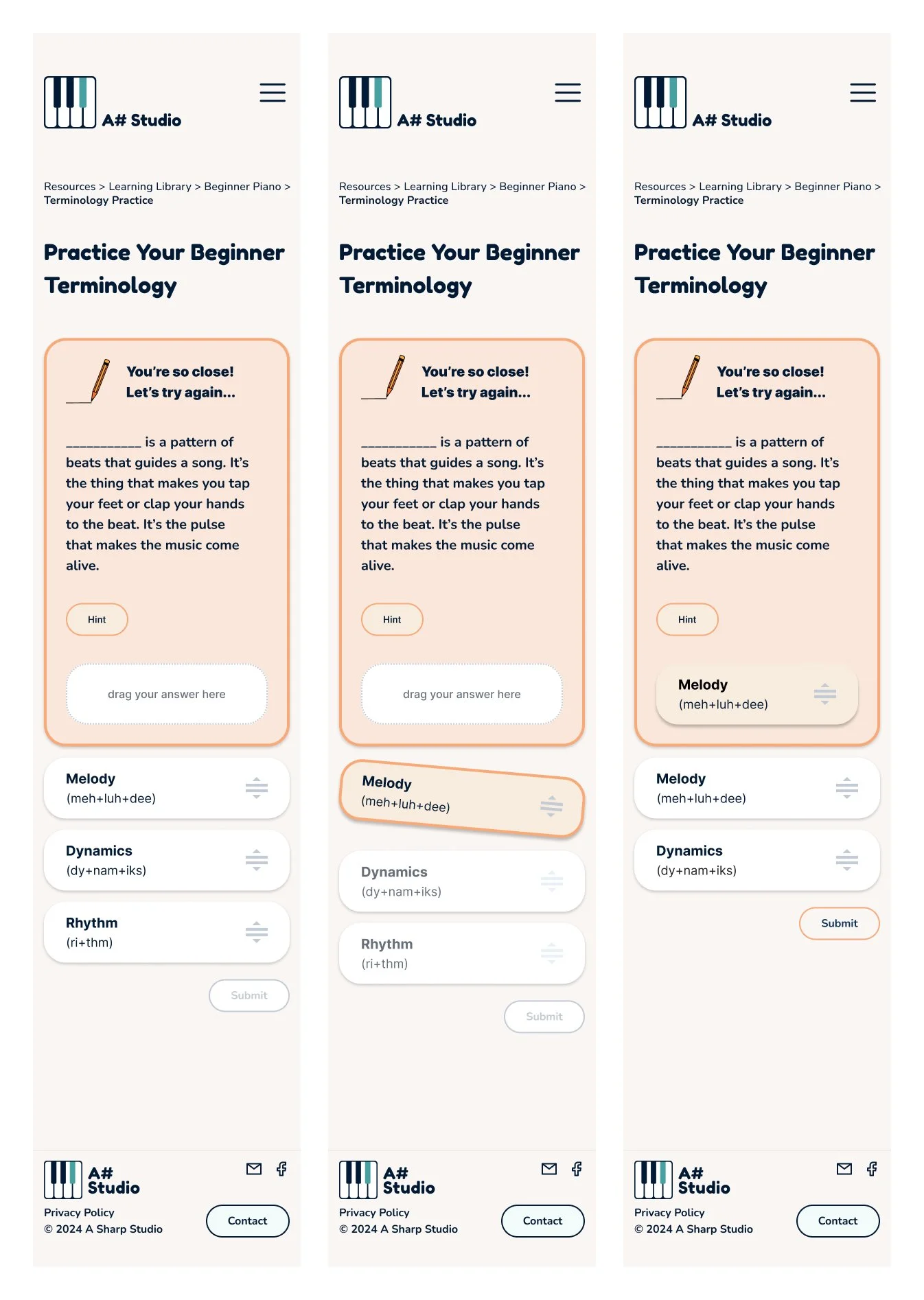
Low and mid-fidelity wireframes were created to establish the structure of these flows. The navigation design aimed to prioritize simplicity for parents while still being intuitive enough for children to use. The card game, designed for beginner students, required drag-and-drop functionality to match terms with definitions.
The most challenging aspect of this phase was designing and prototyping the drag-and-drop interaction. To learn this, I studied drag-and-drop design patterns through YouTube tutorials and articles, iterating the card game design significantly between versions 1.0 and 1.4 before user testing began.
Card Game Demo
Card Game Demo Wireframes
Card Game Evolution
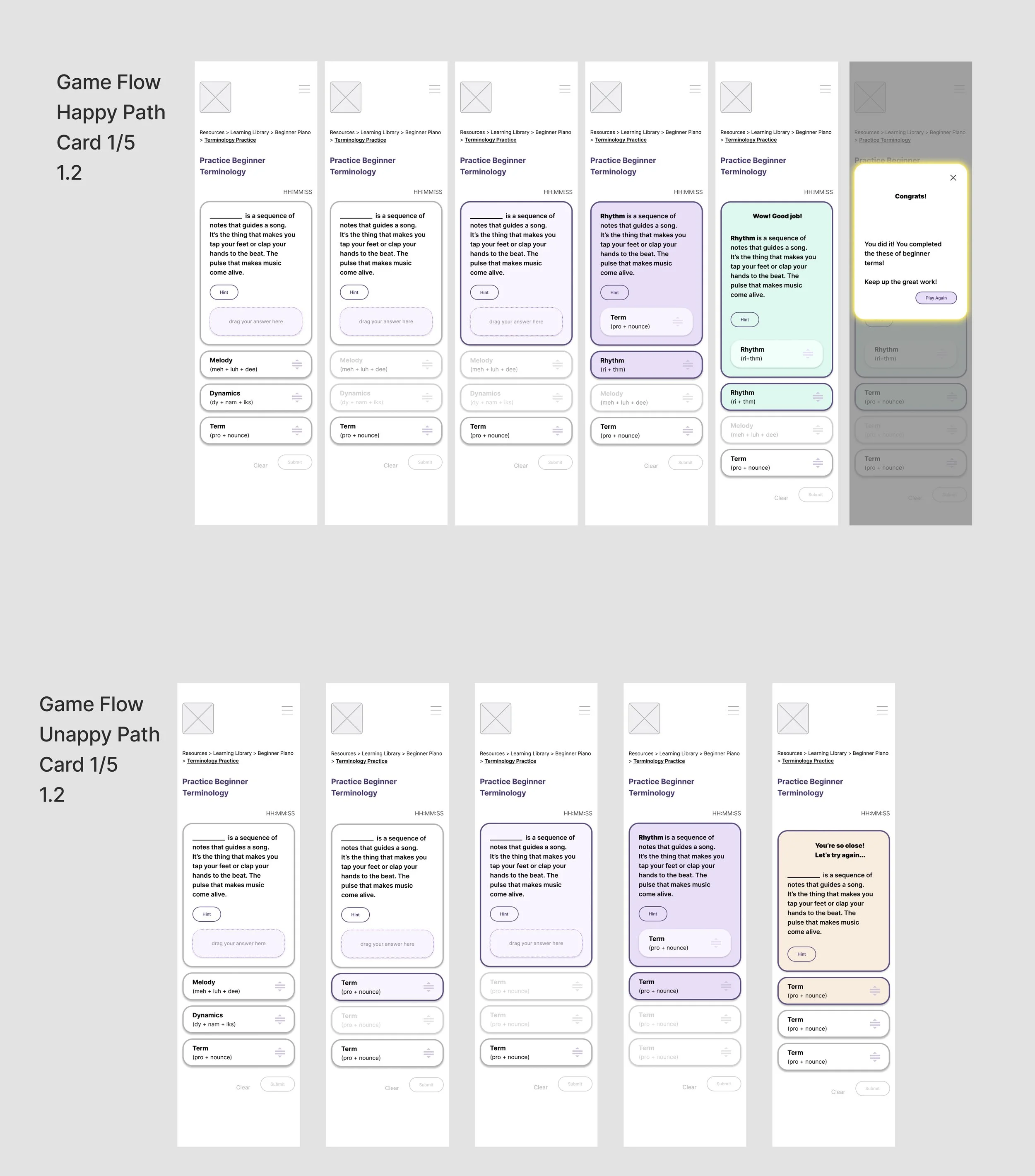
Happy & Unhappy Path 1.4
Happy & Unhappy Path 1.2
Happy & Unhappy Path 1.3
Happy & Unhappy Path 1.1
Prototyping Process
Prototyping presented unique challenges, particularly for the card game and when connecting the primary flows together. Figma allowed for basic drag-and-drop functionality, nut simulating more complex interactions like locking terms with definitions required creative problem-solving. Continually refining the prototypes during the design process ensured they remained functional enough for users to test and successfully provide feedback.
Round 1 User Testing - Low/Mid Fidelity Wireframes
While Round 1 metrics missed many usability goals, the feedback was instrumental in shaping the next iteration.
Overview
Participants: 7 users (6 adults, 1 minor). 5 unmoderated tests and 2 moderated.
Goals: Evaluate ease of navigation from the homepage to the Beginner Learning Resources section and usability of the drag-and-drop card game.
Metrics:
Navigation Menu ease of use 2.57 (Unmet Goal: 2/5)
Ease of navigation from homepage to card game free-flow: 1.75/5 (Met Goal: 2/5)
Ease of navigation form homepage to card came guided: 2.57/5 (Unmet Goal: 2/5)
Ease of completing 1 round of the card game: 2.57/5 (Unmet Goal: 2/5)
List of Iterations for Next Testing:
Confusing navigation: Dropdown arrows were unclear, requiring additional labeling and hierarchy cues.
Insufficient hierarchy: Text and color updates were added to clarify page structure.
Button interaction issues: Buttons were resized to full width and made taller for easier interaction, especially for children.
Unhappy path oversight: Initially overlooked, error handling was addressed in the next iteration. Designing the unhappy path was minimal because of the established design patters. Most of the integration involved prototyping to work the unhappy path in.
Round 1 User Test Results - Survey
Round 2 User Testing - High Fidelity Wireframes
Overview
Participants: 5 users (1 moderated, 4 unmoderated).
Goals: Validate changes made after Round 1 testing and confirm usability improvements. Still aiming for easy of use 2 or lower.
Metrics:
100% completion success rate for the happy path, with 0% misclicks when navigating from homepage to card game
Testers rated navigation from homepage to card game with a mean ease of 1.5
Card game ease of use: 2/5
Round 2 User Test Results - Survey
Round 2 User Test Results - Survey
Results
The changes implemented after Round 1 testing significantly improved usability, achieving or exceeding all target metrics. Users found it easier to navigate to the Beginner Learning Resources section and interact with the card game. Feedback validated the updated navigation structure and interaction design.
Key Iterations and Insights
Navigation Design: Improved clarity by adding labels, using color to emphasize hierarchy, and simplifying dropdown functionality.
Card Game Interaction: Enhanced button size and responsiveness for easier use by children. Error-handling flows were added to address the unhappy path, ensuring a complete user experience.
Focus on Priorities: Two additional beginner resource flows were deprioritized to keep the scope manageable. These wireframes are saved for future development.
While Round 1 metrics fell short of expectations, the feedback gained proved invaluable for guiding iterations. By the second round, the design met usability goals, creating a more intuitive experience for users. The structured testing and iteration process not only improved the current website and card game design but also laid the groundwork for future resource development.
STEP 5: BRANDING & UI
Branding: Reflecting Authenticity and Vibrancy
The A# Studio branding process began with an emphasis on its core values: authenticity, child-centered learning, and a fun, high-quality educational experience. The branding needed to align with the studio's vibrant, teal-colored interior and the lively personality of the teacher, Tricia, who combines playfulness with a dedication to lifelong learning.
Since A# Studio had no prior visual identity, I developed a minimalist logo to represent its current offerings while leaving room for future branding changes as the business name evolves. A sans-serif font was selected for its readability and versatility, offering a variety of weights to establish clear hierarchy.
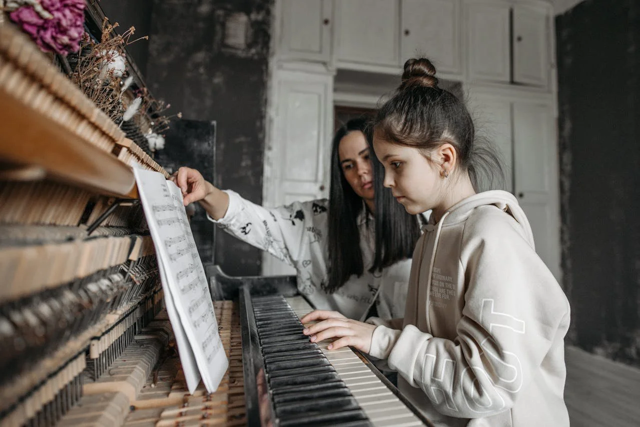
For imagery, I emphasized authenticity by featuring real people in photographs, which reflected the warmth and personal touch of the studio. To ensure the website resonated with both children and parents, the visual identity balanced bright, playful colors (teal, orange, and purple) and whimsical animations from free Lottie files. These animations not only delighted users but also added an engaging, interactive element to the experience, as confirmed by positive survey feedback.
The branding approach also prioritized inclusivity by tailoring the design to appeal to a broad audience of children, parents, and adult learners. User interviews and testing helped refine this balance, ensuring the brand's energy felt playful without overwhelming.
A# Logo Variations
UI Design: Engaging, Accessible & Fun
Design Goals and Challenges
The UI design aimed to create a site that was simple, accessible, and engaging, appealing to both children and their parents. A key challenge was balancing the playful elements for kids with the professional aesthetic parents expect from a trusted music education studio.
By focusing on usability and clarity, I structured the layout to make navigation intuitive for all users. Parents appreciated the site’s approachable vibe, which reassured them that A# Studio fosters a positive, fun learning environment for their children.
Visual Identity in the UI
The teal color—a favorite of the teacher and a reflection of the studio’s personality—served as the primary color throughout the site. Complementary accents of orange (for creativity and warmth) and purple (for trust and integrity) added vibrancy without overwhelming users.
The Nunito typeface was chosen for its rounded edges, which conveyed a friendly yet professional tone. Its variety of font weights allowed for clear text hierarchy, ensuring readability across all devices. Spacing and grouping content thoughtfully helped users easily navigate the site and find the information they needed.
A# Studio - Landing Page
Interactive Elements: Adding Delight
To bring the user experience to life, I incorporated free Lottie animations that created a sense of delight without distracting from the functionality. These animations, particularly in the drag-and-drop card game, received positive feedback from testers, who found the interactions engaging and intuitive.
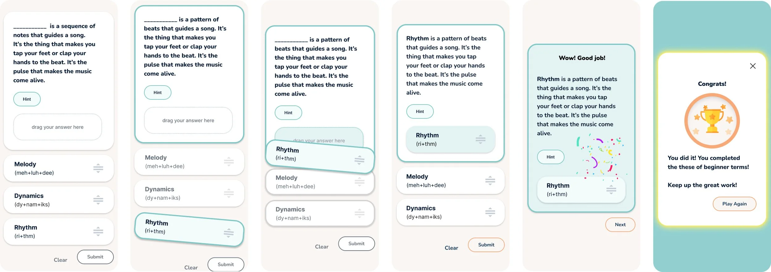
The card game’s drag-and-drop interaction was designed with color, motion, and feedback to guide users through the sequence. Each step—clicking, dragging, dropping, and submitting—had a distinct visual cue, including highlight colors for correct and incorrect answers. These patterns were consistently applied, making the interaction seamless and repeatable for future iterations of the game.
Lottie Animations
Lottie Files
Confetti: Used when user answers the terminology correct.
Trophy: Used when the user completes the terminology deck. I turned the trophy into a badge to help it stand out in the game.
Pencil Erase: Used when the user guesses an incorrect answer. The pencil erase was chosen because it was a gentle way of letting users to that it’s okay to try again.
STEP 6: FINAL ITERATION & PROTOTYPE
Interactive Prototypes
Overall Strategy and Outcomes
To ensure visual consistency, I created a design system within Figma, which included color guides, typefaces, drop shadows, and UI components. This streamlined the process of scaling designs, allowing for easy expansion of the terminology card game into intermediate and advanced levels.
Accessibility was a priority, with all designs meeting WCAG AA standards for color contrast and readability. Larger font sizes (18px) were used to improve readability for children, parents, and adult learners.
The branding and UI design successfully captured A# Studio’s values and personality, with 100% of user testers describing the brand as welcoming, laid back, clean, precise, and professional. In hindsight, I would explore bolder uses of color to further enhance the fun and playful atmosphere, but the overall feedback validated that the design approach resonated deeply with users and stakeholders alike.
Outcomes
The project’s iterative design process resulted in a user-friendly mobile-first website and an engaging interactive tool tailored to A# Studio’s mission of fostering a supportive, child-centered learning environment. By focusing on real user feedback, brand consistency, and accessibility, we created a design that met both the studio’s needs and its students’ expectations.
Key Metrics and Improvements
Round 1 (Low/Mid-Fidelity Testing)
In the initial round of testing, we identified several challenges in navigation and usability. Metrics revealed that navigation from the homepage to the Beginner Learning Resources section and interaction with the card game required refinement.
Navigation Menu: The ease of use rated below the goal mark, signaling the need for clearer labeling, hierarchy, and reversing the dropdown arrow.
Card Game Navigation: The unmoderated test fell below the goal and effected the users ability to successfully navigate form the homepage to the card game screen.
Card Game Completion: The ease of completion was just below our goal indicating that the game’s design needed more intuitive interaction elements.
Round 2 (High-Fidelity Testing)
The second round of testing demonstrated significant improvement across key metrics.
Completion Success Rate: 100% completion rate for the happy path with 0% misclicks when navigating from the homepage to the card game.
Card Game Interaction: The ease of use of the card game improved to a mean score of 2/5 with the usability metrics meeting the project goals.
Navigation Feedback: Testers rated navigation from the homepage to the card game with a mean ease of 1.5, surpassing the goal, and validating the updates made in the first iteration.
Key Iterations & Insights
Navigation Improvements
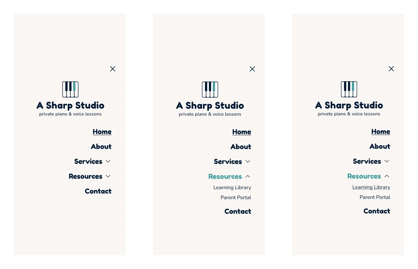
The primary focus was to make navigation intuitive for both parents and children. Reversing the dropdown/collapse arrows, text updates, branding, and color hierarchy provided clarity and made the website more approachable. A prominent and simplified navigation menu helped users locate resources without confusion.
Round 1 User Testing Navigation Menu
Latest Navigation Menu
Card Game Enhancements
We focused on refining the drag-and-drop functionality, improving button size and interaction for younger users. Error handling for the "unhappy path" ensured users could navigate smoothly even if they made mistakes. Feedback loops, including visual cues for correct and incorrect answers, enhanced the educational value and engagement of the card game.
Card Game Wireframes or Round 1 User Test
Current Card Game Happy Path
Content Prioritization
As the designs progressed, we continued to minimize and refine during every iteration.
As part of the design iteration, we deprioritized two additional beginner resource flows to help parents in order to focus on the most critical feature, the beginner music terminology card game. This decision kept the scope manageable while ensuring the core resources were polished for launch.
Later I recognized that the unhappy path was needed for the card game prototype to have the fullest functionality possible. I prioritized replicating the happy path frames and integrated/refined the pre-established UI designs, in addition to prototyping the screens into the card game sequence.
I also added more hierarchy in the breadcrumbs navigation and renamed labels to match titles used on screens.
Unhappy Path Flow
Branding & Visual Identity Success
The branding process successfully captured the warmth, authenticity, and vibrancy of A# Studio. The minimalistic logo design, combined with playful color choices and real photography, reflected the personal, child-centered approach of the studio.
Color Palette: The use of teal as the primary color helped communicate the teacher’s dynamic personality, with complementary accents of orange and purple evoking creativity, warmth, and trust.
Typography: The choice of the Nunito typeface for its rounded, friendly appearance ensured the text was clear and approachable, particularly for children and parents. Its versatility allowed for clear hierarchy, making the content easy to navigate.
The website design and branding were particularly praised for their ability to balance professionalism with playfulness, appealing to both parents seeking trust and children looking for an engaging experience.
UI Design & Interactive Elements
The UI design focused on creating a fun, accessible, and engaging experience for both parents and children. Key highlights include:
Interactive Design: Free Lottie animations added delight to the user experience, especially within the card game. These animations were met with positive feedback, helping make the learning process more interactive and enjoyable.
Accessibility Features: The design adhered to WCAG AA standards, ensuring that the website was accessible to users with varying abilities. Larger font sizes (18px) and thoughtful content grouping made the site easier to navigate, especially for parents with young children.
Key Challenges, Future Considerations & Learnings
Adapting to Challenges and Envisioning Growth
Designing for A# Studio presented unique challenges that tested both my adaptability and creative problem-solving abilities. From navigating prototyping limitations to recruiting participants without access to the studio’s clients, I learned to think outside the box and stay resourceful in the face of obstacles. By interviewing both children and parents aligned with the studio’s demographic, I ensured the design was grounded in real user insights, creating a unique solution tailored to A# Studio that sets it apart from competitors.
The prototyping process was another area of growth. Simulating the drag-and-drop functionality in Figma revealed limitations that slowed progress, but this challenge allowed me to explore innovative workarounds and hone my skills in designing interactive experiences. Through these obstacles, I grew more confident in my ability to tackle complex projects with determination and creativity.
Future Considerations and Opportunities
Looking ahead, the next priority is building out a complete set of beginner terminology cards or, at minimum, providing necessary content for developers to implement within the pre-established design patterns for the happy and unhappy paths. Once this foundation is complete, the focus will shift to adding "About," "Testimonials," and FAQ sections—key features that will enhance the website's appeal to prospective students and parents.
There’s also significant potential for future iterations of the terminology card game. Expanding to intermediate and advanced levels are likely to provide value to returning students while supporting lifelong learning. Additionally, scaling the resource library with interactive tools and personalized features could help A# Studio continue to grow and innovate for students at home practice.
Key Learnings and Reflection
This project was a testament to the value of adaptability, creativity, and user-centered design. By embracing challenges and pivoting when necessary, I was able to deliver an engaging, thoughtfully designed solution that balances playfulness for children with the professionalism expected by parents.
As I reflect on the process, I’m proud of how this project has sharpened my ability to solve complex prototyping problems and build designs that feel both delightful and functional. Moving forward, I’m excited to continue refining my skills, learning from challenges, and designing experiences that empower users and create delightful interactions.

